SALT
Salt is all about delivering substance, meaning and clarity to the world of branding.
In cooking, salt is added to food – not to taste the salt itself – but to enhance the flavours of the key ingredients.
In branding, SALT does the same. Their purpose is to help their clients articulate the meaning and purpose of their brand. To enhance the flavours of their key ingredients so that their audience can’t get enough.
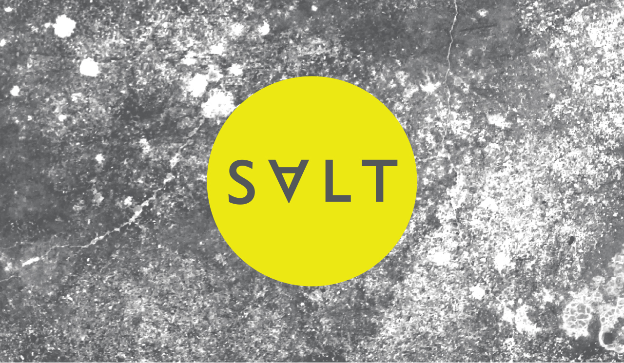
SALT owner Elina Wilson approached Chops for Tea to create an identity that would express the complex aspect of her business in a simple way. The result teams a minimal wordmark over a subtle — but at the same time complex — pattern created by salt crystals.
Deliverables
+ Visual Identity
+ Style Guide
+ Business Stationery
+ Proposal Folder & Power Point Deck
+ Keynote presentation
+ Responsive website
Working with CFT has been a delightful experience. I’ve particularly enjoyed their strategic thinking and amazing talent of translating these thoughts into visual gems. On top of that, they’re ready to bend over backwards to deliver top quality work for clients.
Elina Wilson
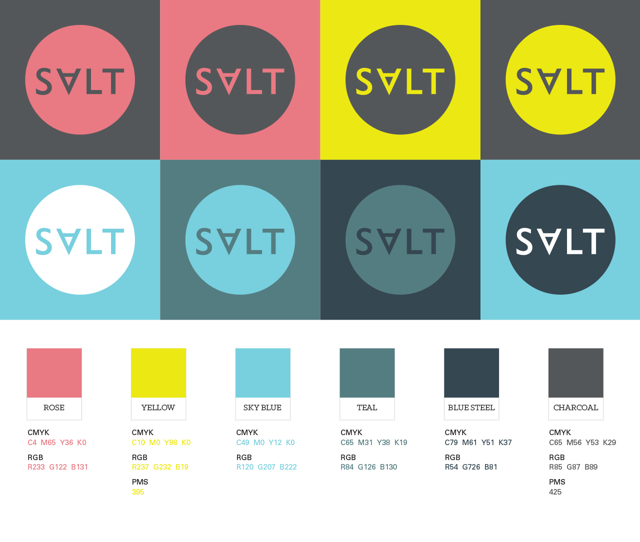
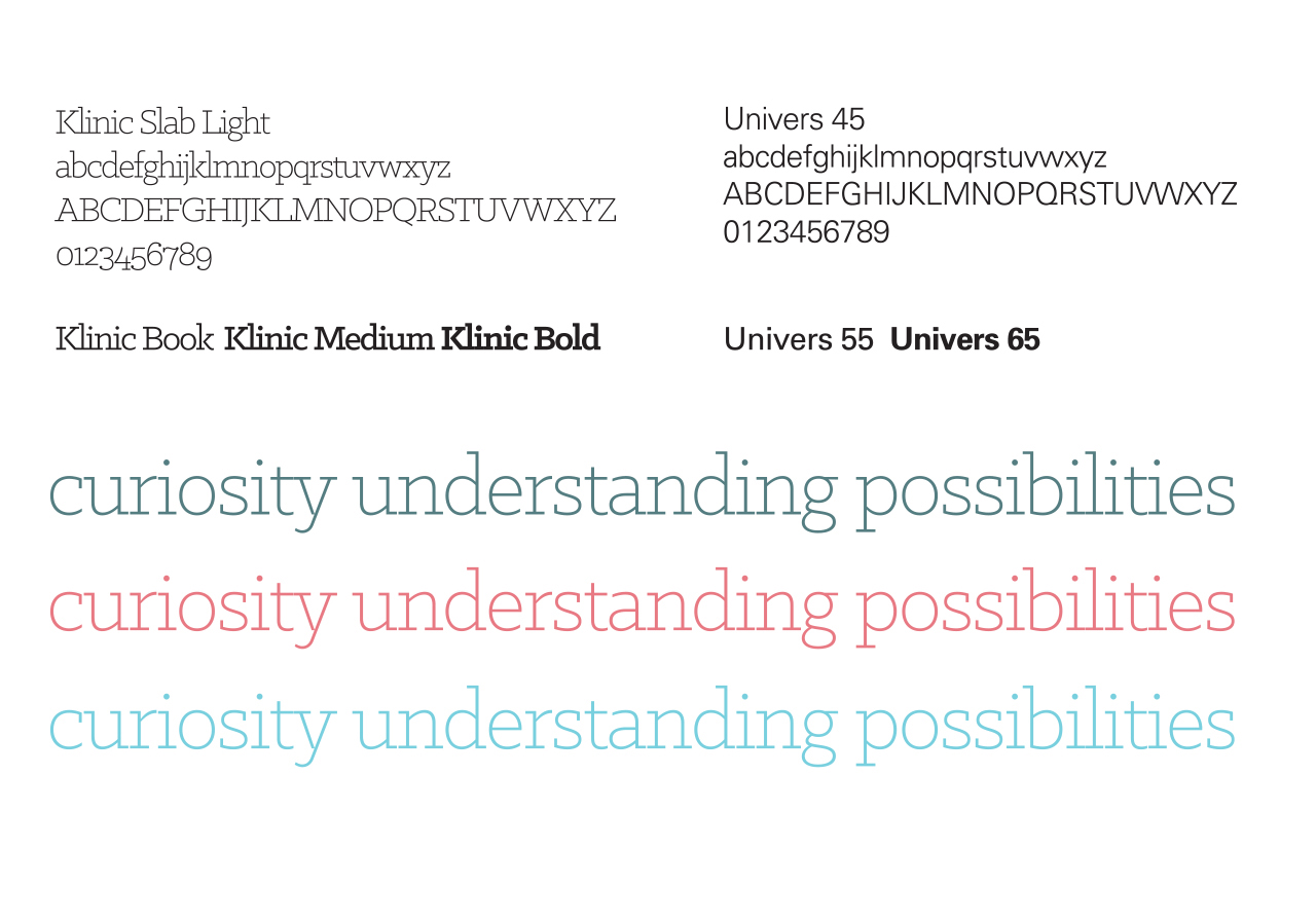
The descriptor we developed encapsulates the essence of the Salt brand
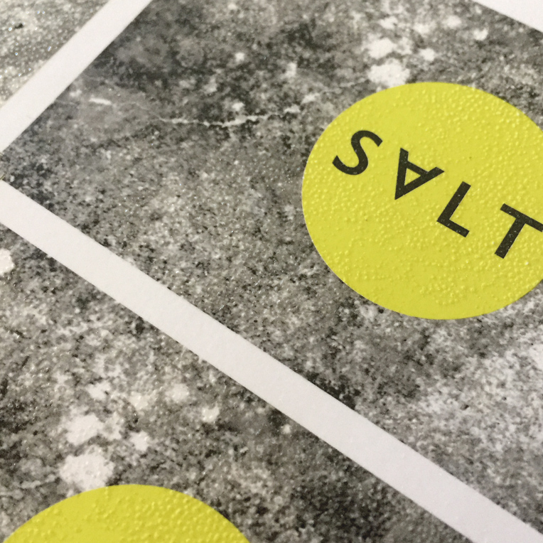
We worked closely with our printer in Melbourne to develop a raised pattern using special UV varnishing techniques. This texture on the business card adds a wonderful tactile element and reinforcing the Salt brand values.

Salt business card
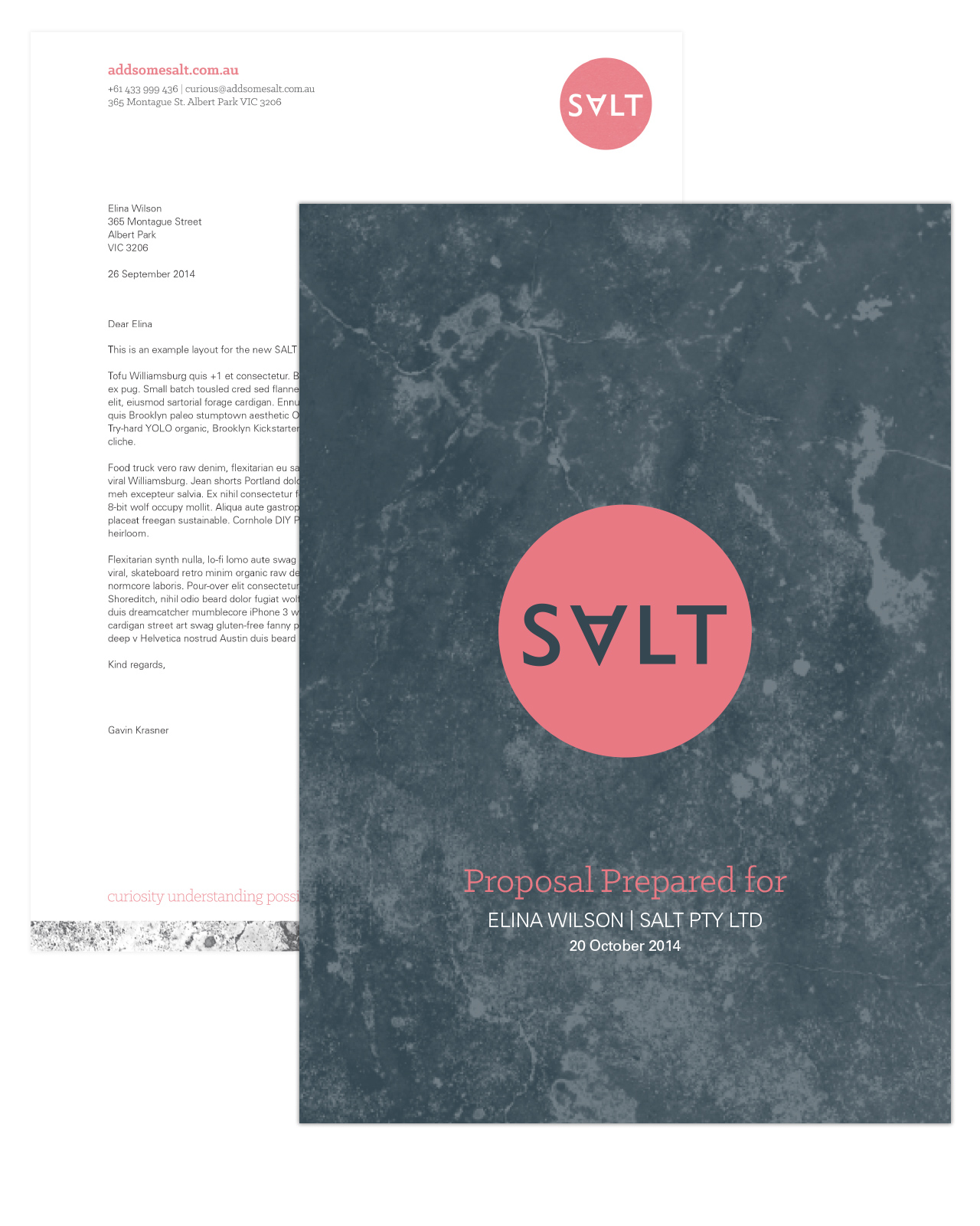
A simple yet striking proposal cover and letterhead that creates real impact.
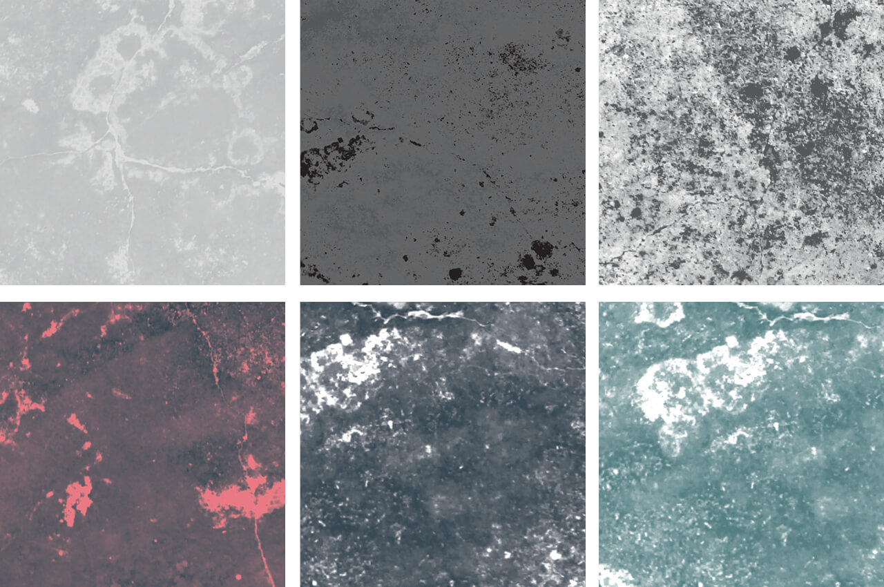
We had fun generating lots of salt crystal patterns.
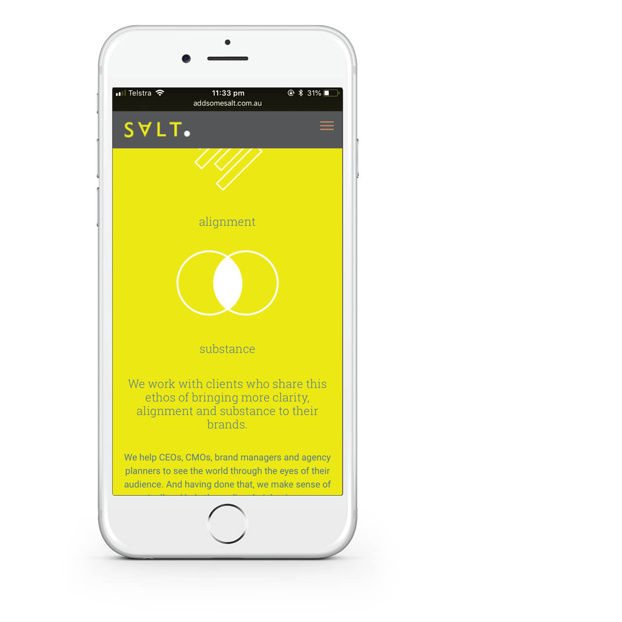
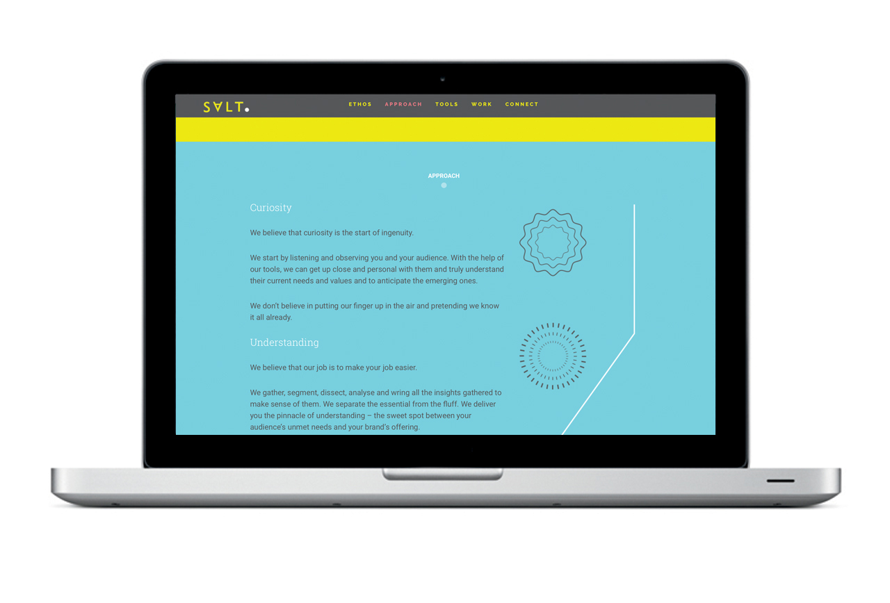
The SALT website uses simple iconography and colour blocking.
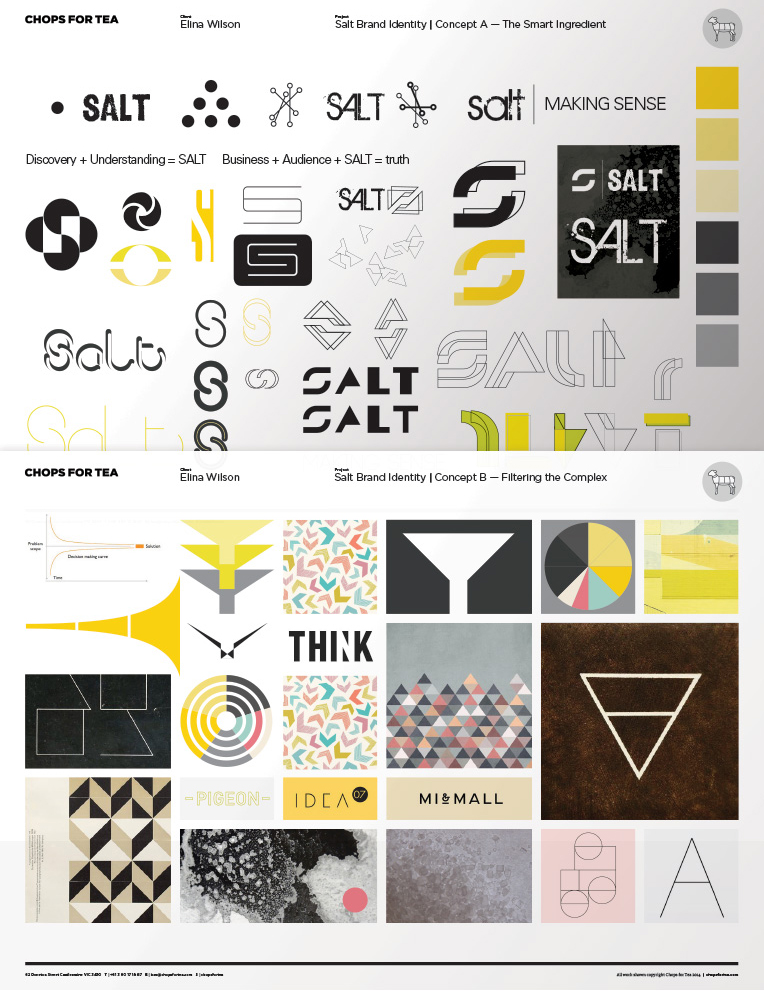
Spreads from a couple of initial concept boards: “The Smart Ingredient” & “filtering the complex”. Concepts boards play a vital role in the design process, allowing our clients to understand how ideas and concepts are formed and to see a scope of possibilities.
