AMPERSAND INTERNATIONAL
Rather than replicate what it said on the tin, our identity for Ampersand International employs a signature — an energetic, hand-drawn flourish — that represents their bespoke approach to the needs of their clients and candidates.
Ampersand describe themselves as a ‘high touch’ recruitment consultancy and we’ve worked with them since 2009, watching their meteoric rise from humble beginning in Melbourne’s Docklands, to reworking their branding to reflect their international reach with offices across Australia and beyond a few years ago.
The identity we created has stood the test of time — almost 10 years — and this really sets them apart. The inspiration being simply to communicate a personal touch, something that Ampersand pride themselves on.
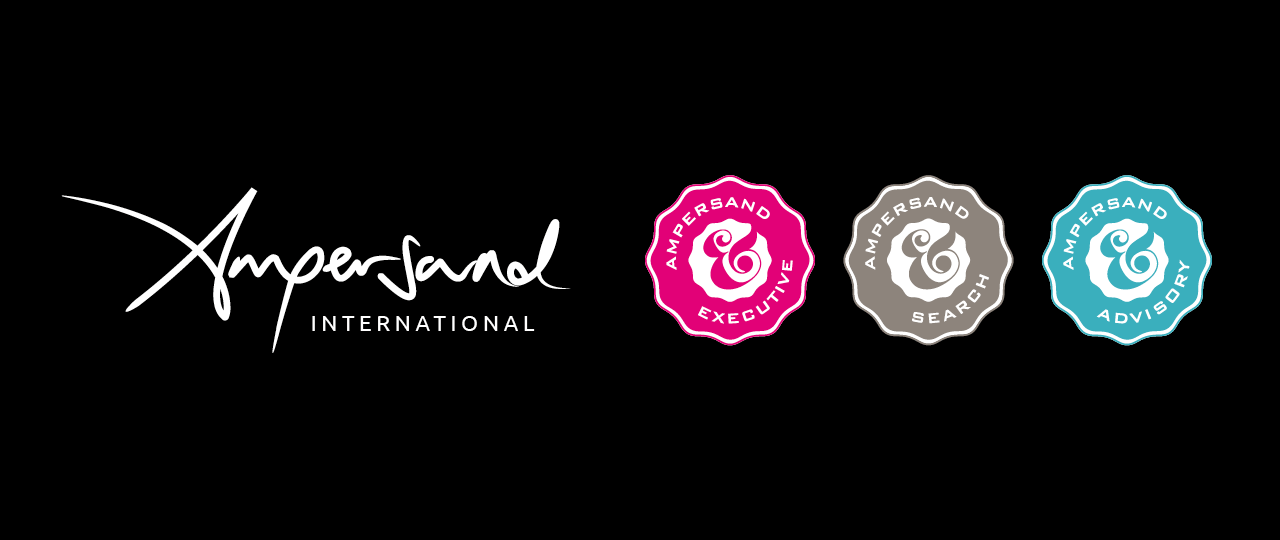
We added three seals that distinguish the different service lines within the business — a nod to Ampersand humble beginnings, reinventing the previous ampersand graphic they were using. We also created a distinctive Ampersand pattern that functioned as their ‘5th element’.
To complete their brand identity we chose an exceptionally bold corporate colour, known in the printing trade as Rubine Red, but you’d probably call it bright pink as a lead for the Executive are of the business.
This unmistakably confident brand demonstrates that not only do Ampersand do things differently to their competitors, they are thought leaders in their conservative industry. We’ve developed 2 iterations of their website incorporating all the features
![]()
The identity program that Chops For Tea conceived and implemented perfectly fits our position in a competitive market place. It’s gives us huge visibility and reflects the nature of what we do.
Hayley James, Managing Director
Deliverables
+ Brand Identity
+ Brand Guidelines
+ Business Stationery
+ Client / Candidate Report Doucuments
+ Website & Newsletters
+ Event Promotions & Collateral
+ Welcome Video
+ Christmas Promotions
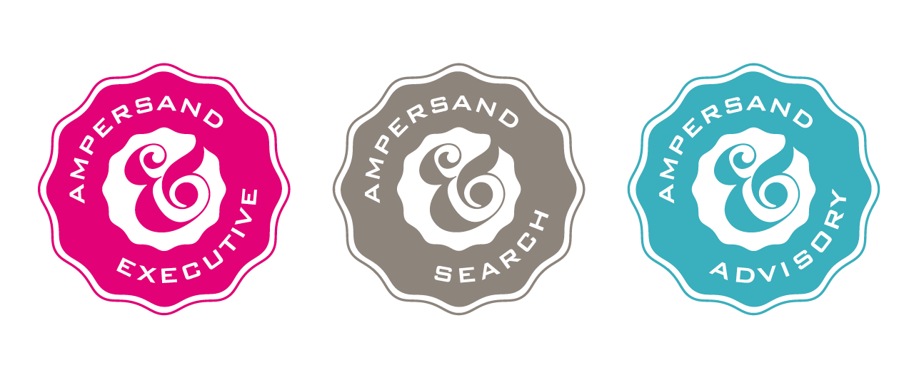 We developed the Ampersand seals to define segments within the Ampersand business.
They work with and without the Ampersand brand signature.
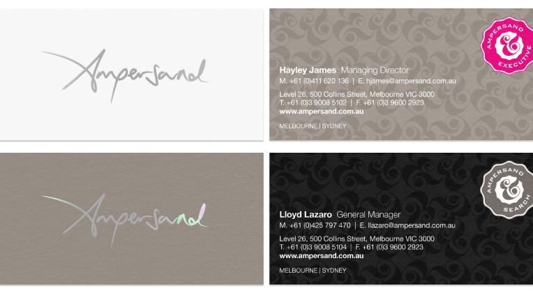
Presentation is everything.
The Ampersand business cards and stationery were originally printed on Mohawk superfine — a beautiful uncoated stock — that holds the metallic inks, gun metal foil and blind embossing perfectly, achieving a tactile and elegant finish that compliments the high-end, elegant Ampersand’s brand profile.
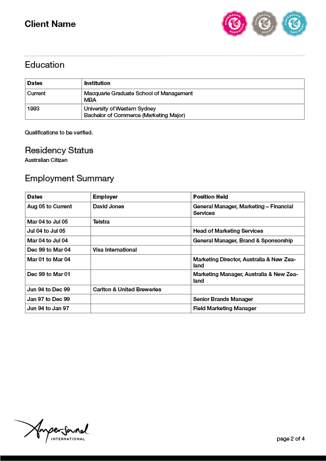
Client Reports are an integral part of the Ampersand business. They feedback candidate’s performance details. Ampersand’s business is built of trust, good judgement and ultimately, understanding human behaviour. Their business is only as good as the ‘talent’ they can recommend to their clients.

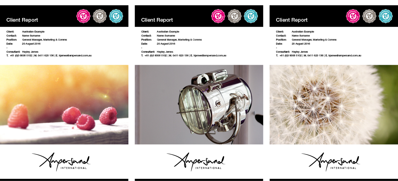
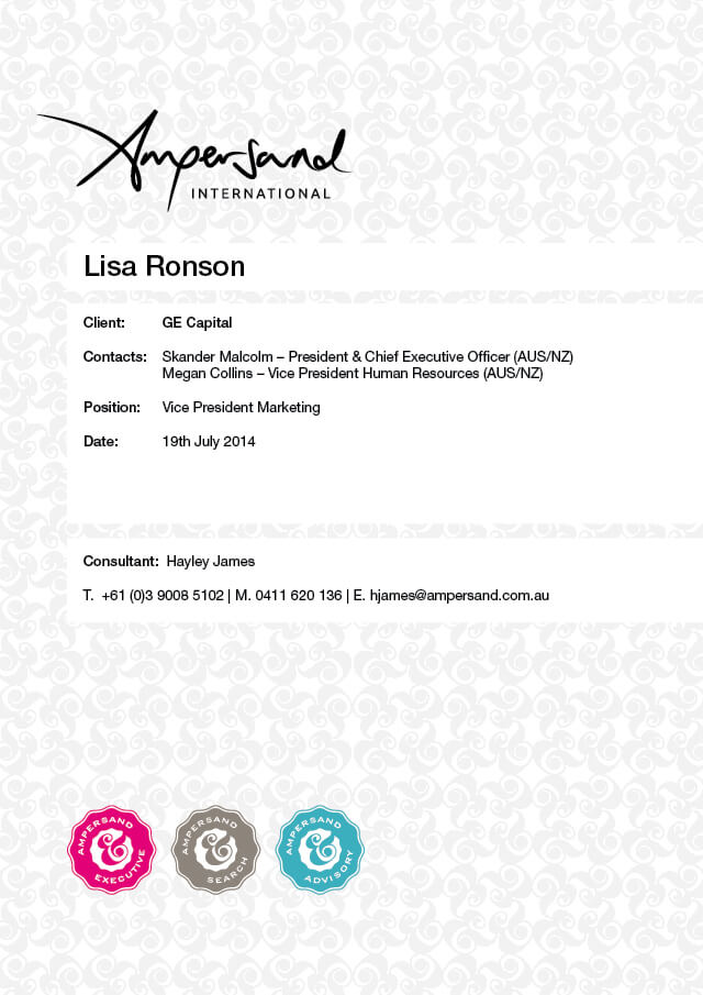
A4 blind embossed client report folder
Marketing and promotion — Ampersand company overview…

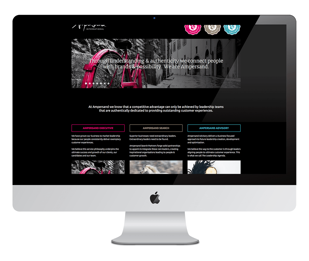
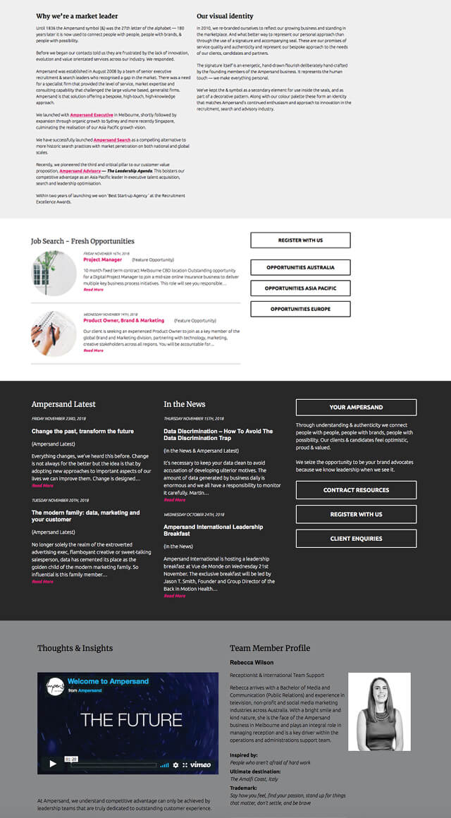
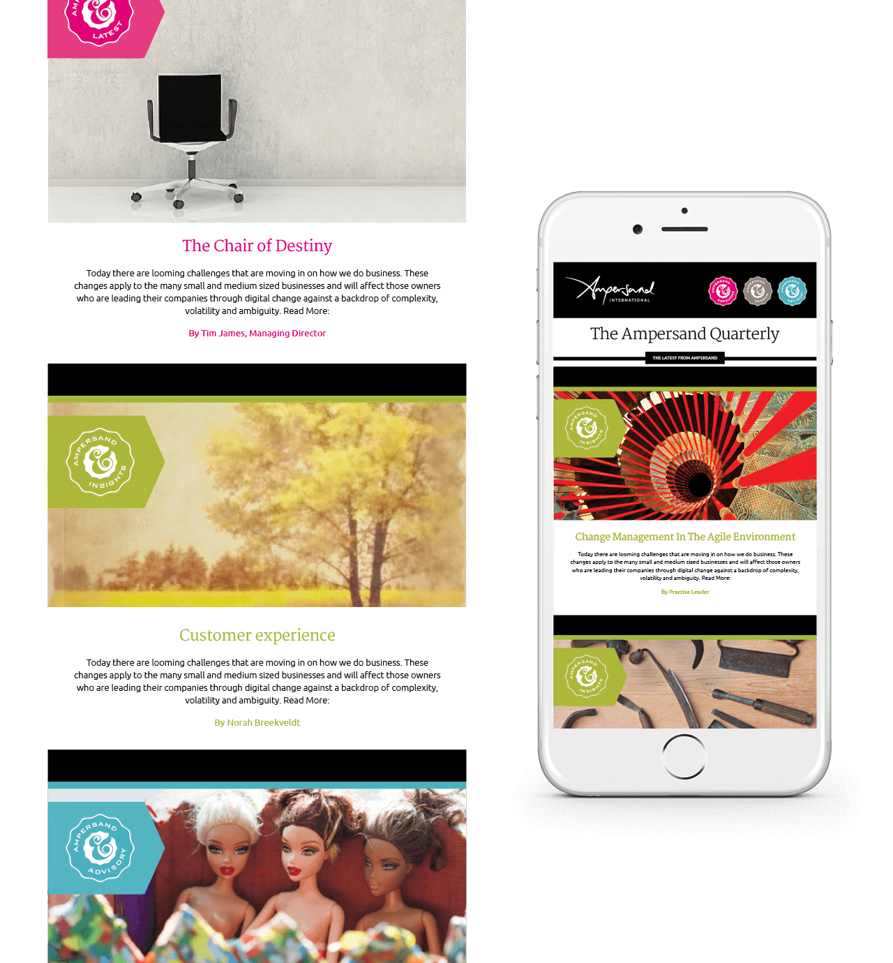
The Ampersand International website is packed full of useful functionality including a job board that links to SEEK.
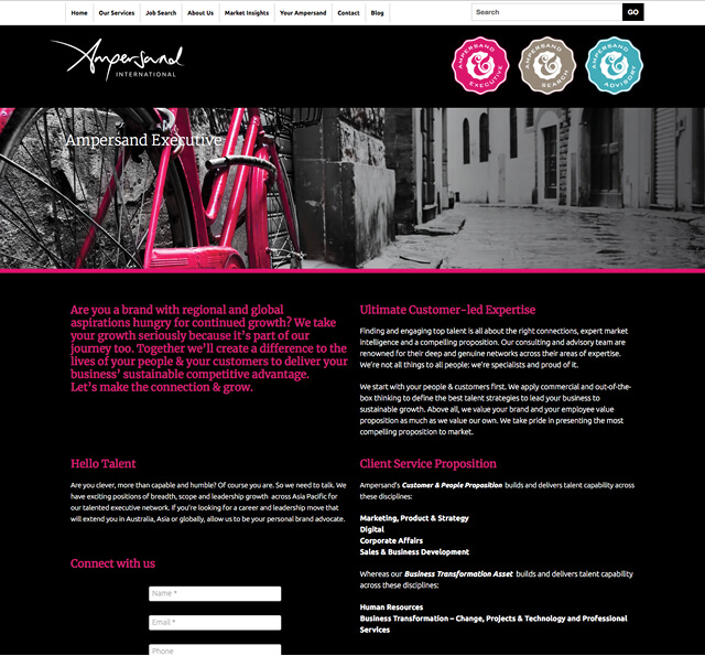
The Current iteration of the Ampersand website —
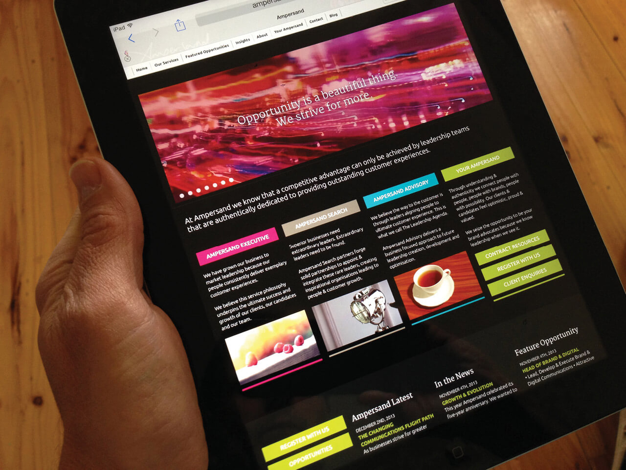
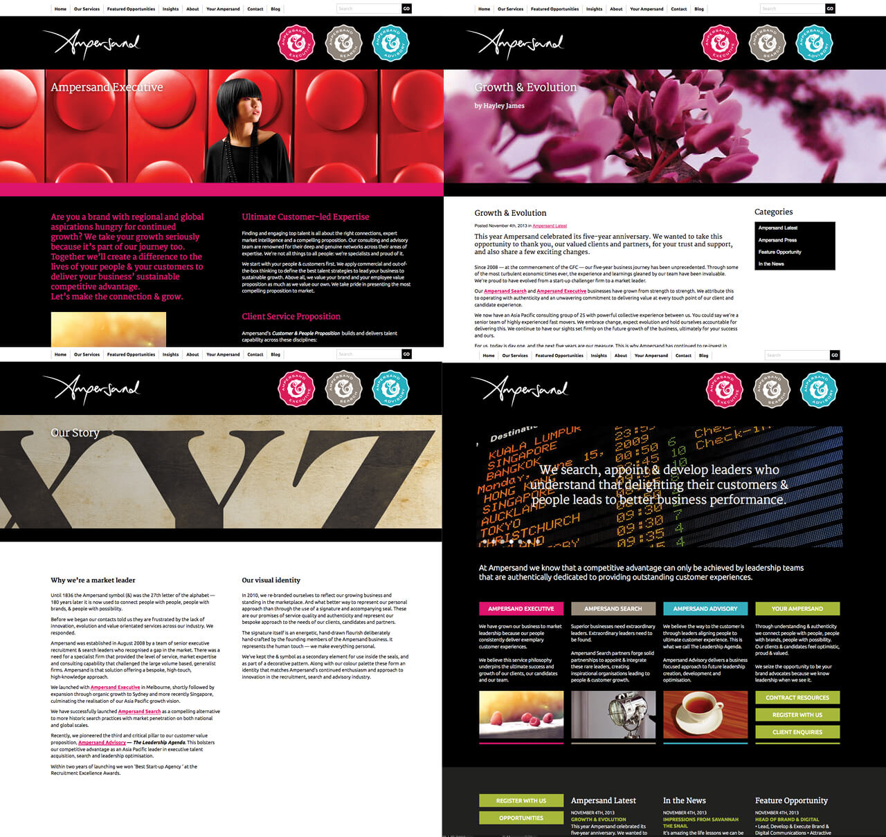
Our first iteration of the Ampersand website ran from 2010—2015
We create and manage Ampersand’s eDM campaigns and use the thoroughly entertaining Mailchimp service. We also look after all of Ampersand’s press ads that feature in the major national papers and manage their presence in trade journals.
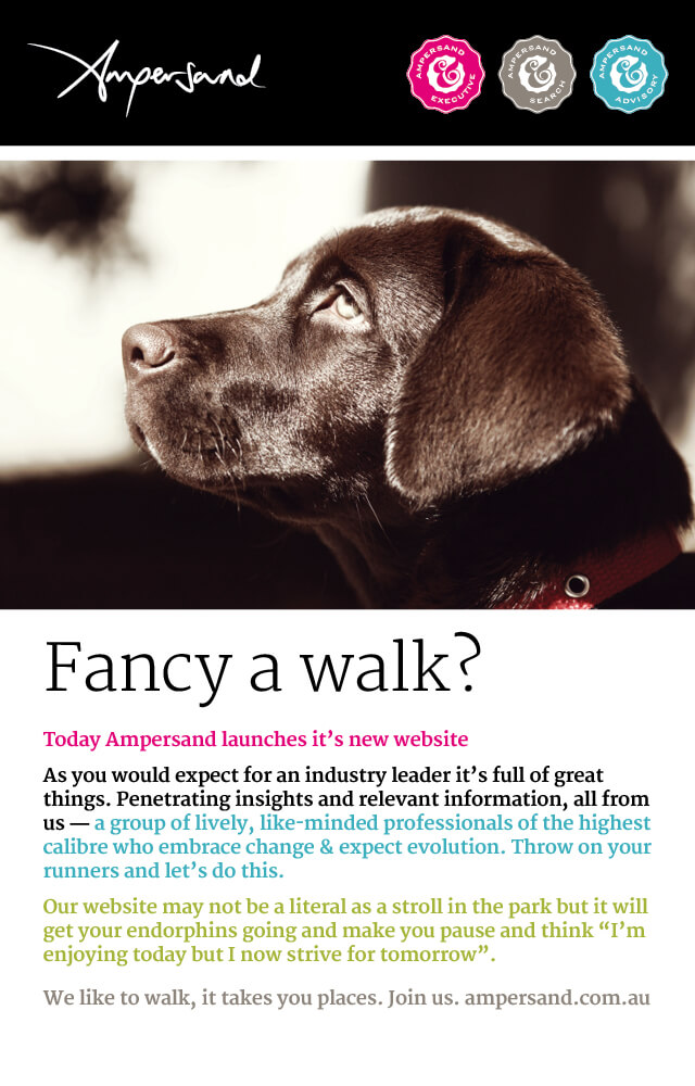
Additional marketing has been extensive over the years. From a regular Christmas card and video to promotional for events such as their highly successful breakfast series…
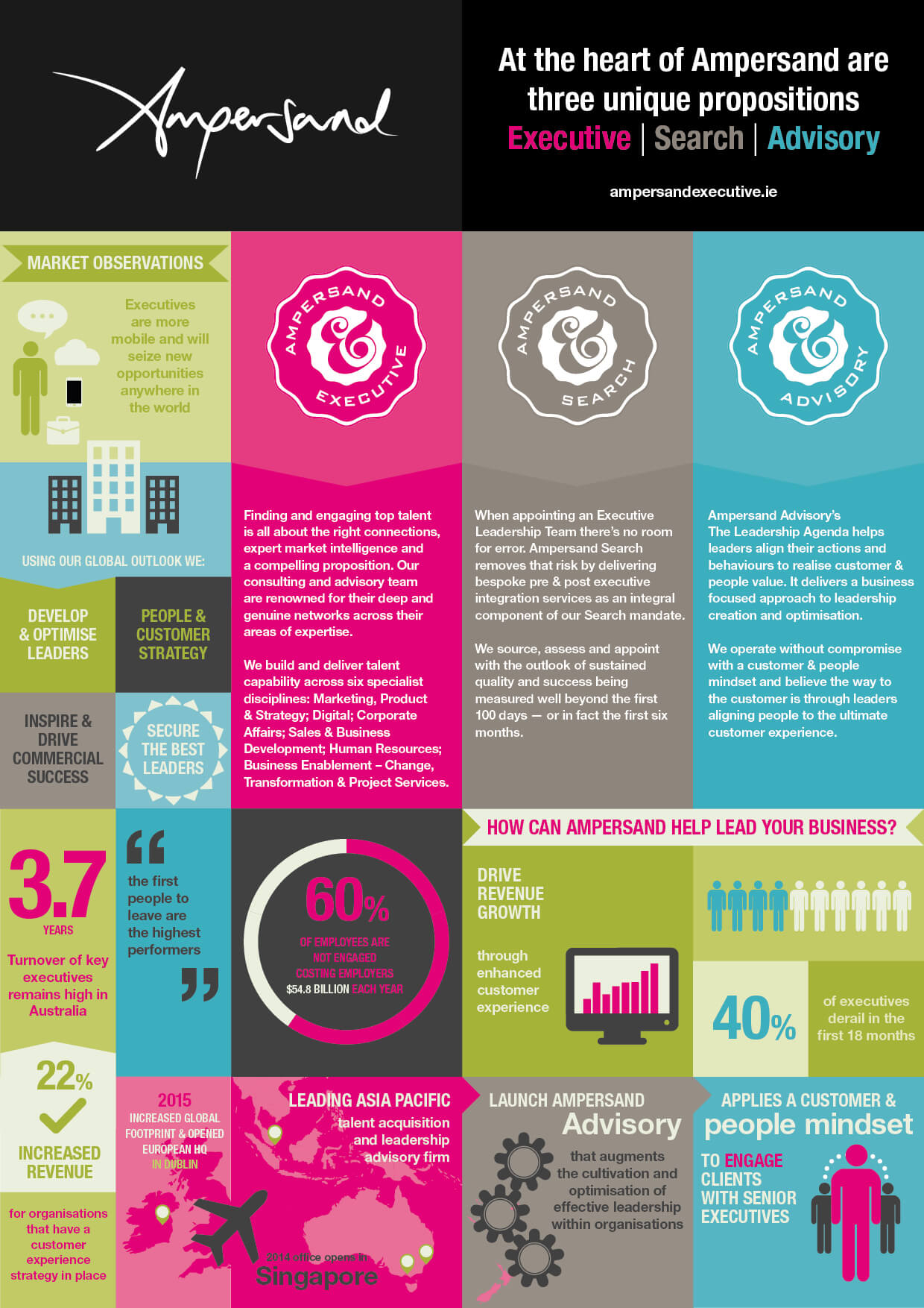
The Ampersand Infographic