CANCER COUNCIL VICTORIA
We worked alongside our friends at Hot Black Interiors to create environmental graphics, signage & wayfinding for Cancer Council Victoria’s new headquarters in Melbourne.
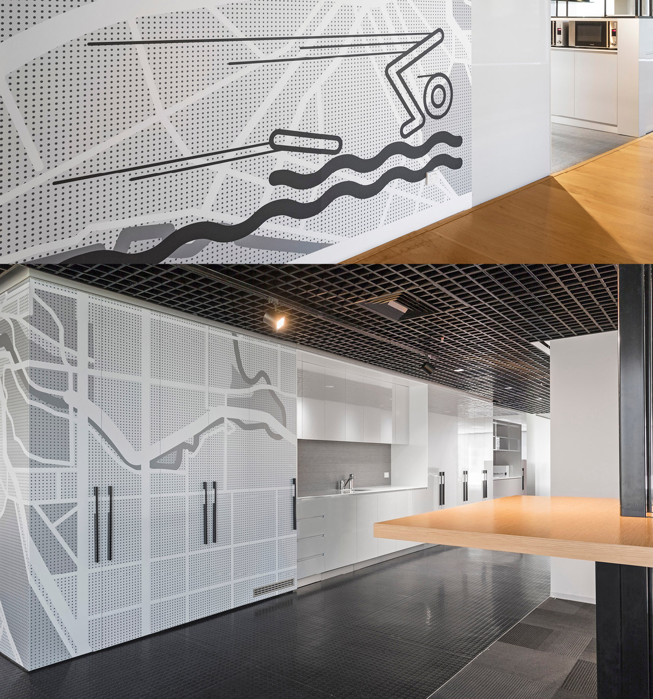
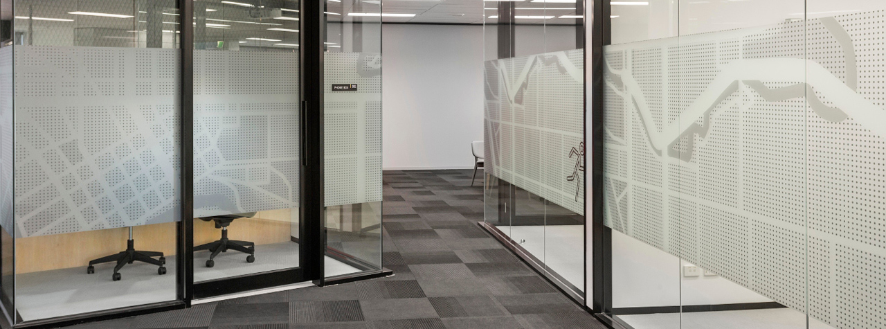
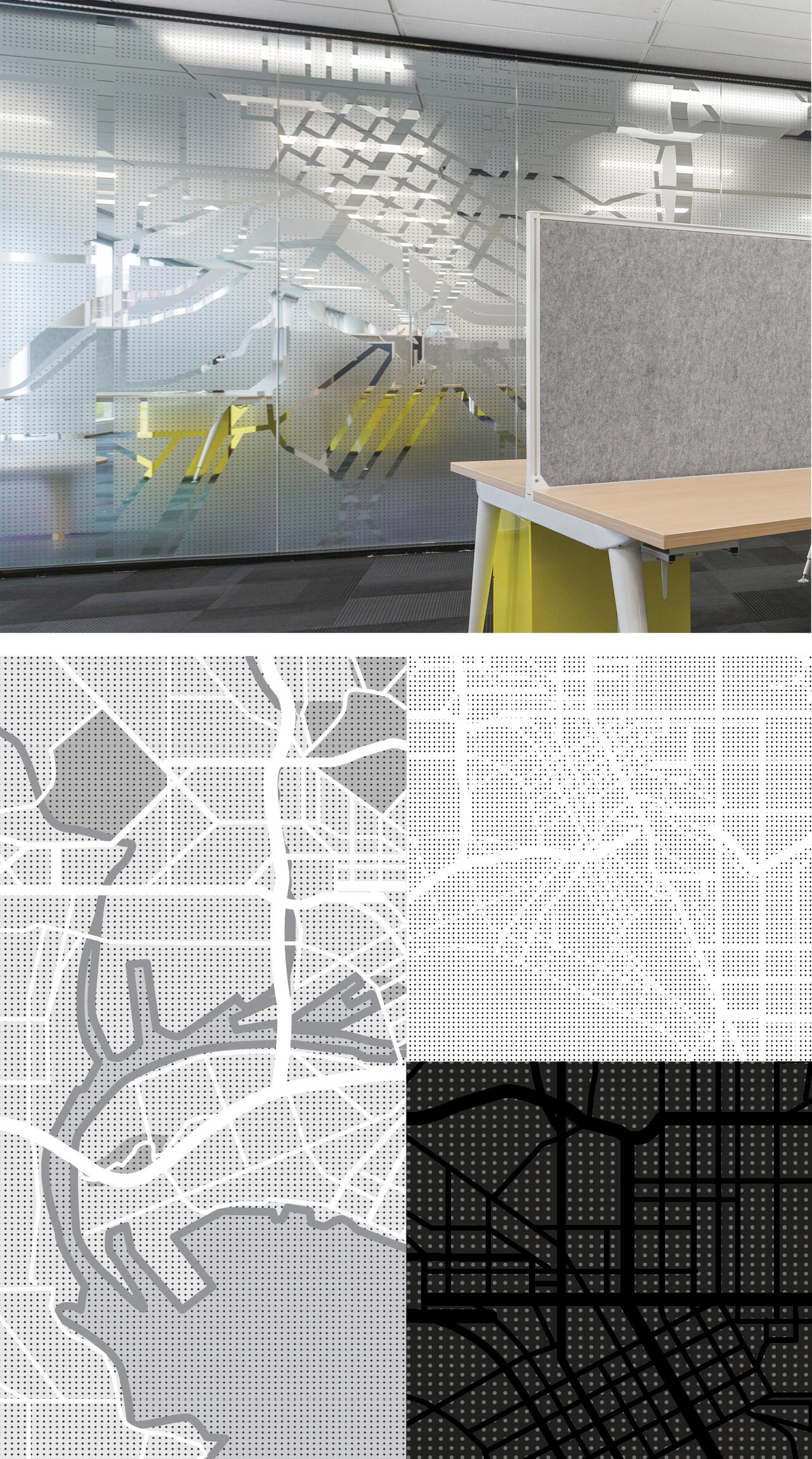
Our brief asked us to consider a graphic language that promoted well-being fro the staff members. We adopted an active theme for each of the floor levels. This was expressed by developing bespoke iconography and the creation of stylised mapping of Melbourne’s streets. These themes appear throughout the building, the maps often used as privacy screening for the many glass walled meeting rooms.
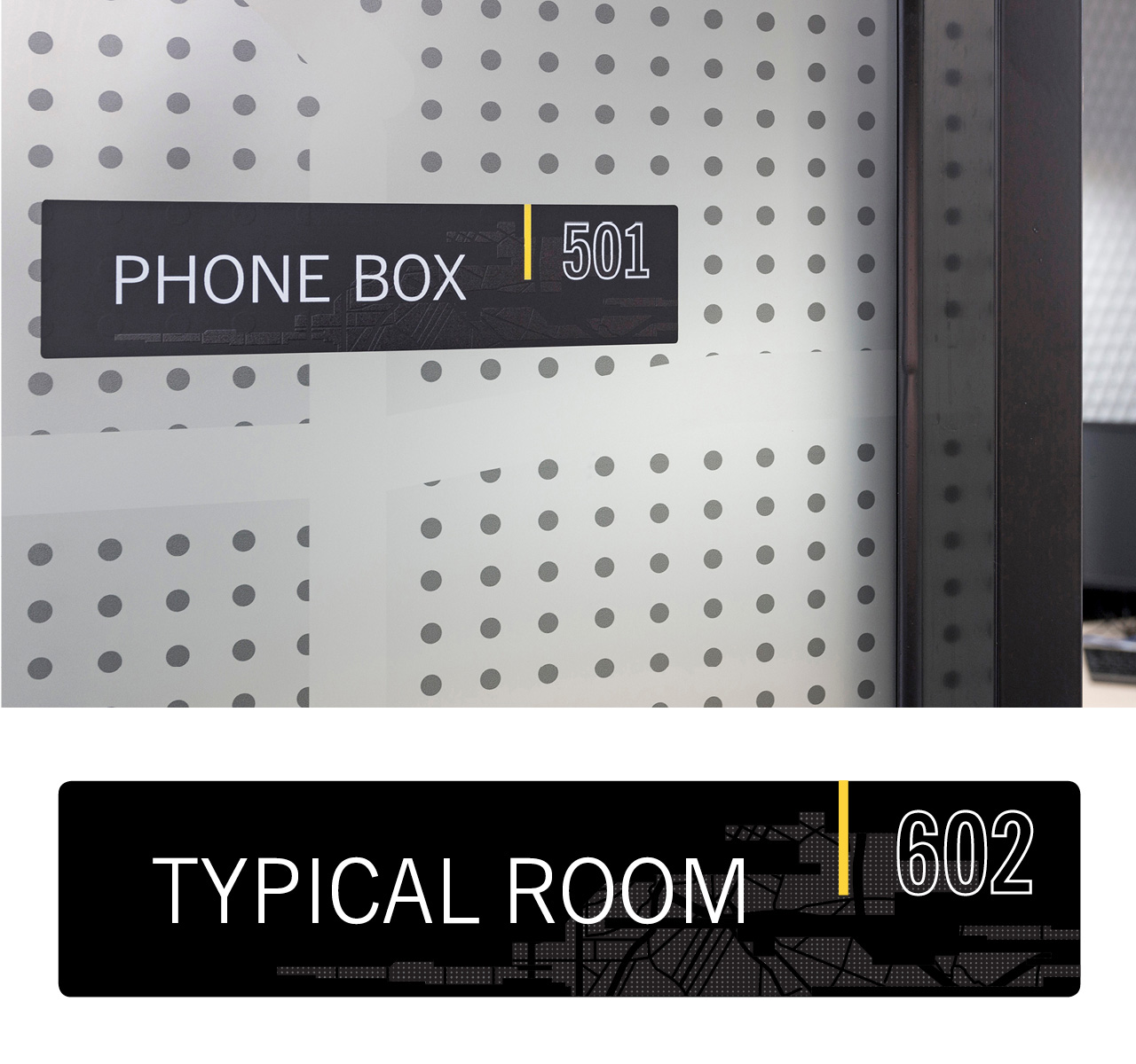
Typography for the directory and room identification tags utilise the modern, minimal look of News Gothic which compliments the graphics neatly. The whole scheme punctuates the clean minimal look that Hot Black’s interiors afford.
Cancer Council Victoria (CCV) provides services for the Victorian community across a range of cancer control areas including research, prevention and support. CCV actively fund raises to support this work.
Deliverables
+ Environmental graphics
+ Wayfinding
+ Icon design
+ Type design
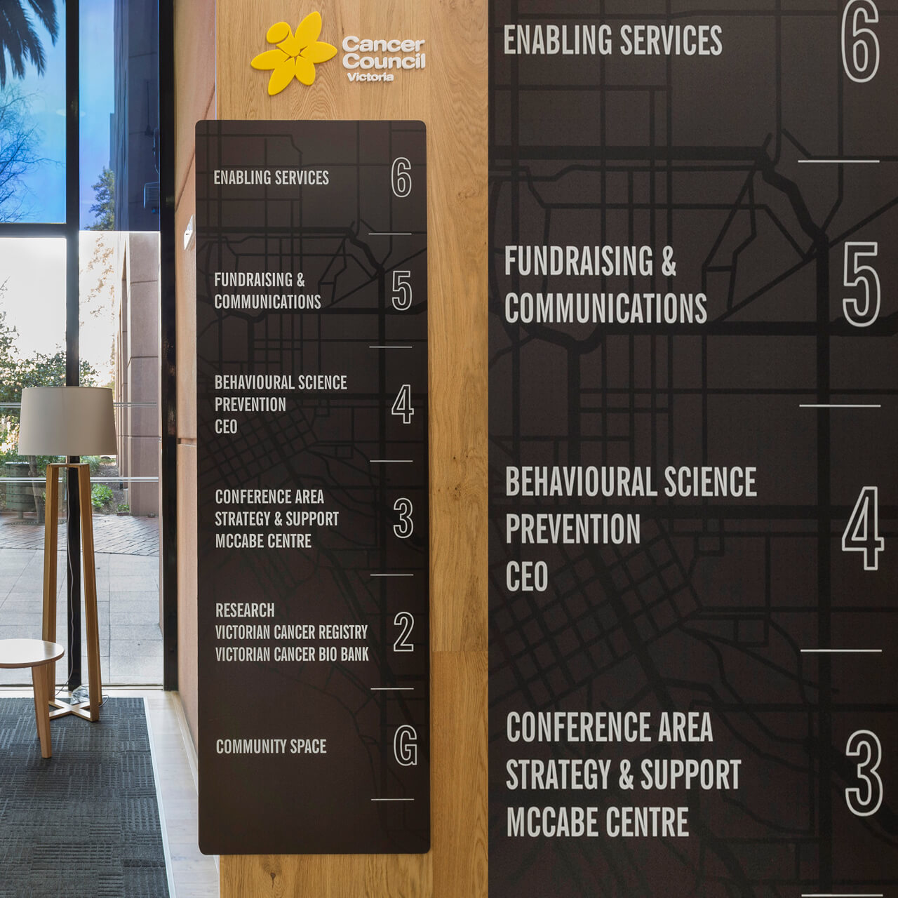
We created a simple way finding system.
Entrance directory board features here.
![]()
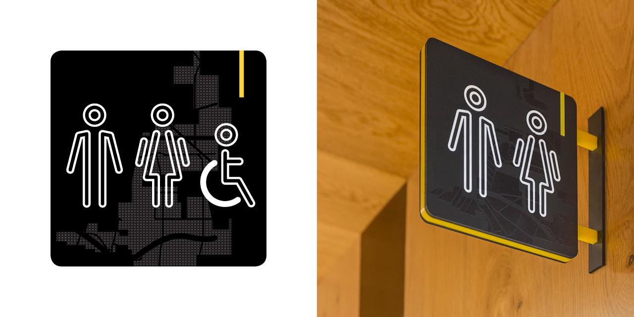
We designed bespoke iconography, assigning an activity to each floor level.
Cancer Council promote healthy living and a healthy environment for their team.
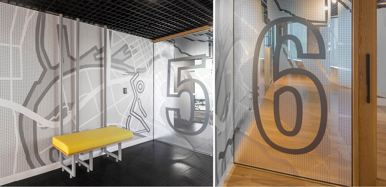
Oversized floor numbers appear on every foyer level.
The destination signage
We adopted a striking yellow (Cancer Council) flash across all signage. This highlight worked well offsetting the black & grey mapping graphics.
Map design & application.
The map detail features the central Melbourne grid of streets and the Yarra River and is used throughout the building acting as screening device for glass meeting rooms.
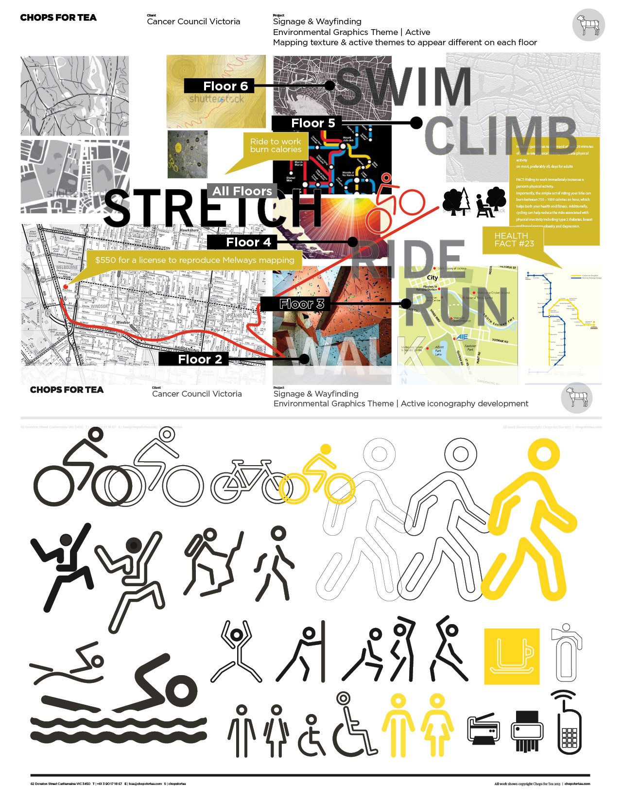
Concept development boards
Our stage 2 presentation explored initial mapping direction and iconography styles
Photography by Nicole Reed. Interior Design by Hot Black.