HEALTH.COM.AU
health.com.au is Australia’s newest private health insurance fund. Though when we started working with them they weren’t.
When they were still just ‘an idea’ we gave them a brand identity and supplied all their graphic design needs. We helped them with their presentation materials when applying for an Application for Registration with the Minister for Health. Then through a series of brand workshops we collectively honed a vision and created a voice and a brand. We created the brand; brand principles document; product brochures; policy guides, claims card; welcome pack; a multitude of banner advertising executions (launch and campaign specific); avatars and other social media graphics; mailchimp newsletters and infographics.
We also provide their copywriting needs (value statements, copy deck, brochure and web copy, SMS texts, cancellation letters, radio ad, animation script) giving them their own straightforward tone of voice to match their promise of simple, hassle-free health insurance.
GMHBA Limited acquired health.com.au Pty Ltd in July 2015.
Deliverables
+ Brand Workshops
+ Brand Identity
+ Brand Principles spreads
+ Product Disclosure Statements
+ Script and illustrations for animation
+ Banner campaign on Google Display Network
Almost 10 years ago Chops helped us created the visual aesthetic and tone of voice that it still lives and breathes in the brand today – that longevity is the hallmark of our successful partnership. I have no hesitation recommending Chops for Tea to any business no matter their size or purpose – their agile and highly collaborative approach is the perfect platform for creating impact and long lasting results.Chloe Quin, Digital Marketing Director
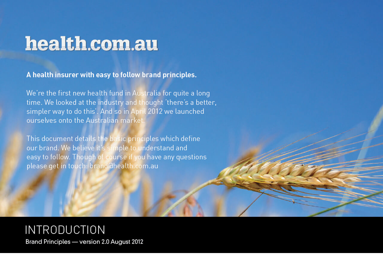
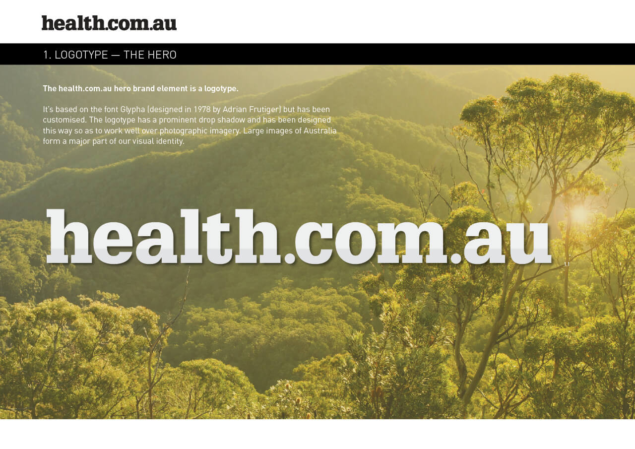
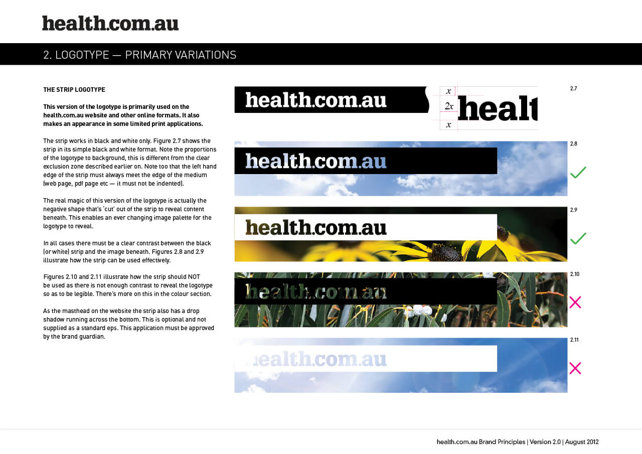
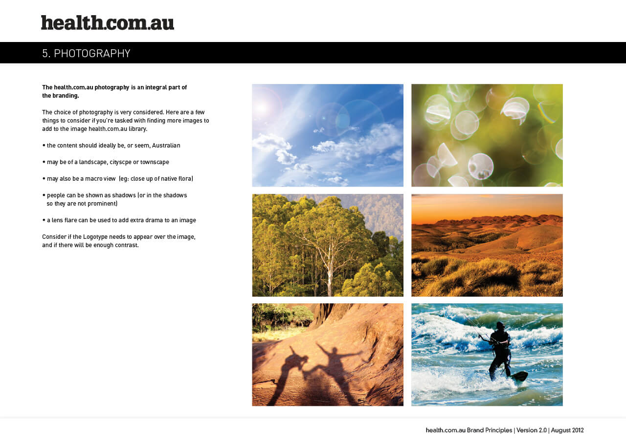
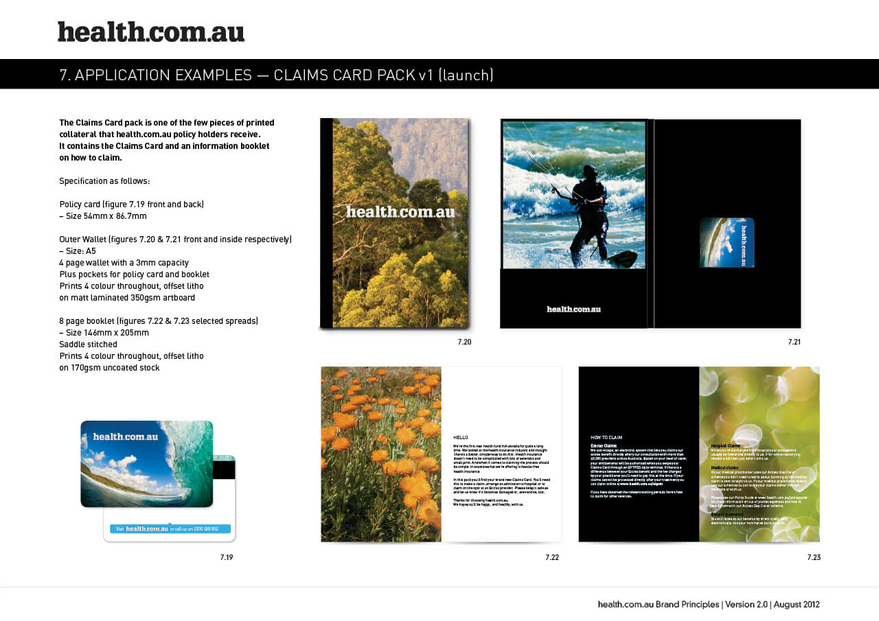
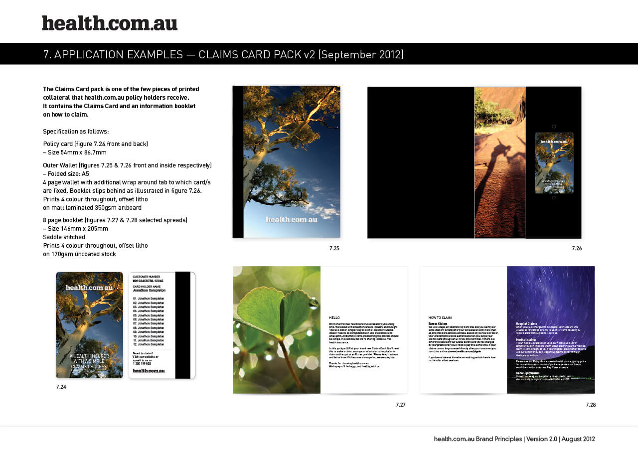
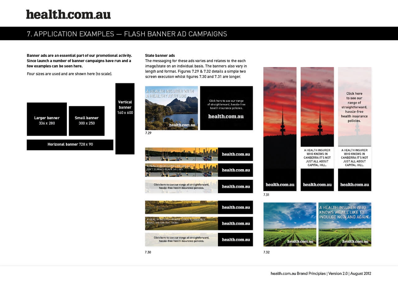
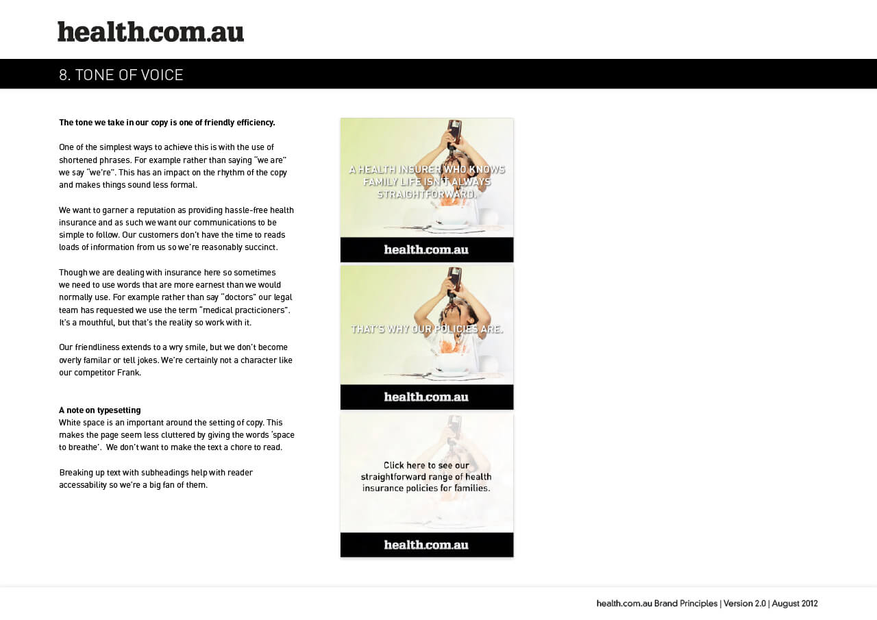
The health.com.au brand principles document is extensive.
This represents the launch & 2nd year of health’s trading. It details all aspects of the brand — from how to use the brand identity through to photographic style, tone of voice & applications.
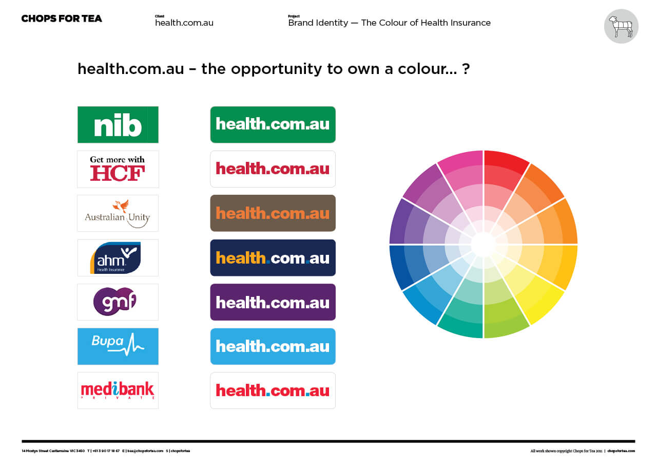
What colour is our brand identity going to be?
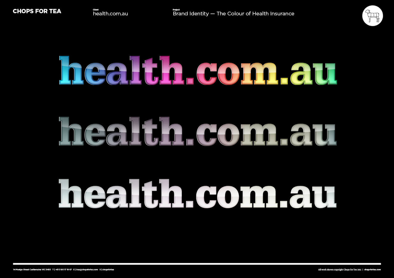
When it comes to ‘reading’ an image we see colour first. And colour taps straight into a barrage of influences deep within us — which is why colour is often an essential part of a brand identity. However, colour is also subjective. (you can read more about colour theory here — link to blog post).
The Chops For Tea brand workshop is designed to challenge our clients, to get them to think about the real values behind their business and to focus on the one singular value that defines them best. And colour can play and important role in expressing this.
Through a series of games, multiple groups arrived at the same value that set health.com.au apart from the competition. The focus was simply “Hassle-Free” health insurance.
And when we sat our brand into the competitive landscape, the answer to the question became very clear. The idea of hassle-free could equal – black & white. So through our brand workshop process we presented an opportunity not to be aligned with one colour – but with all colours, and all people. And this notion led us to the first iteration of the brand communications, celebrating the great Australian landscape.
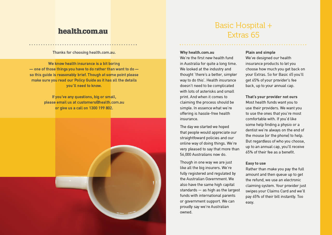
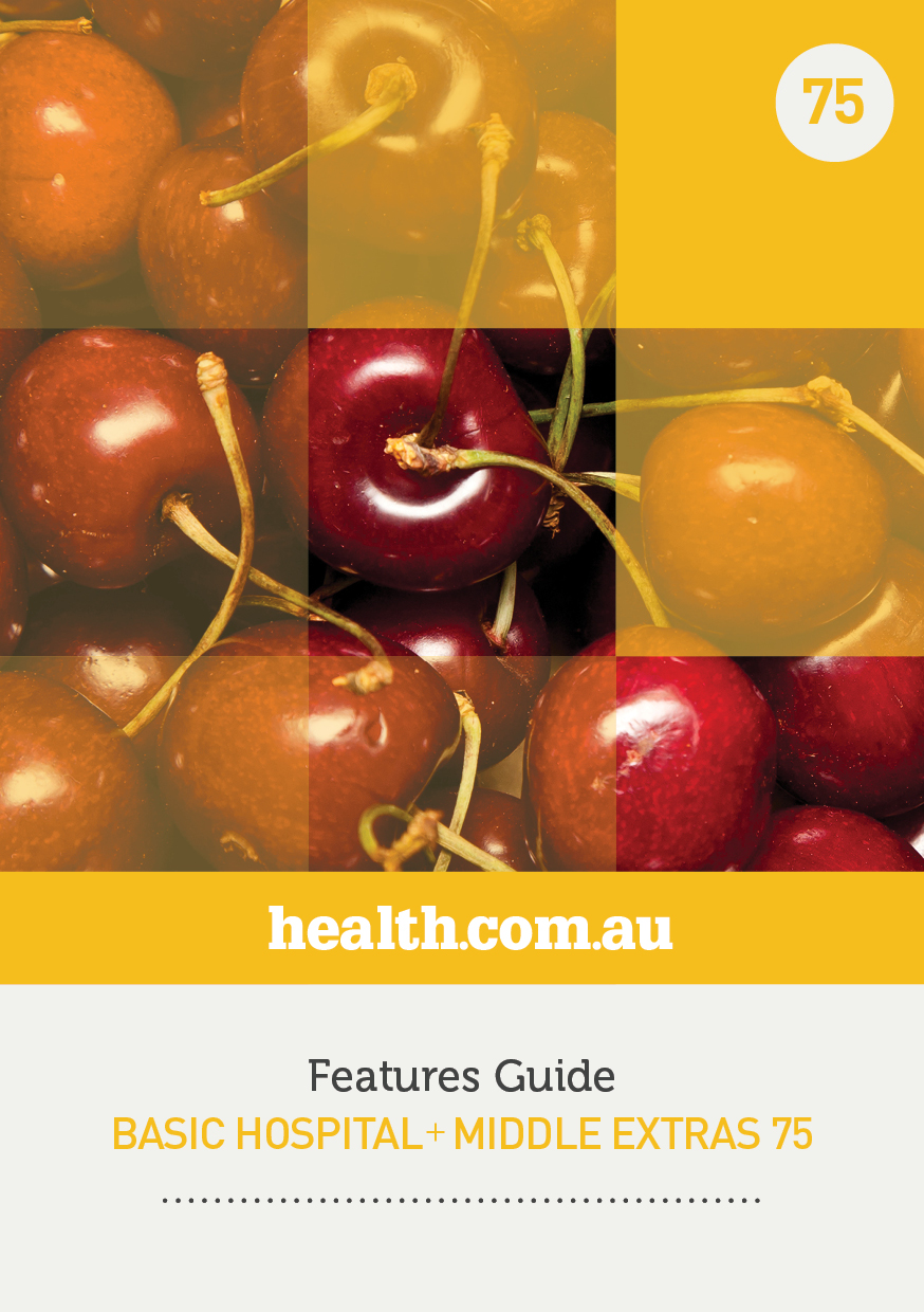
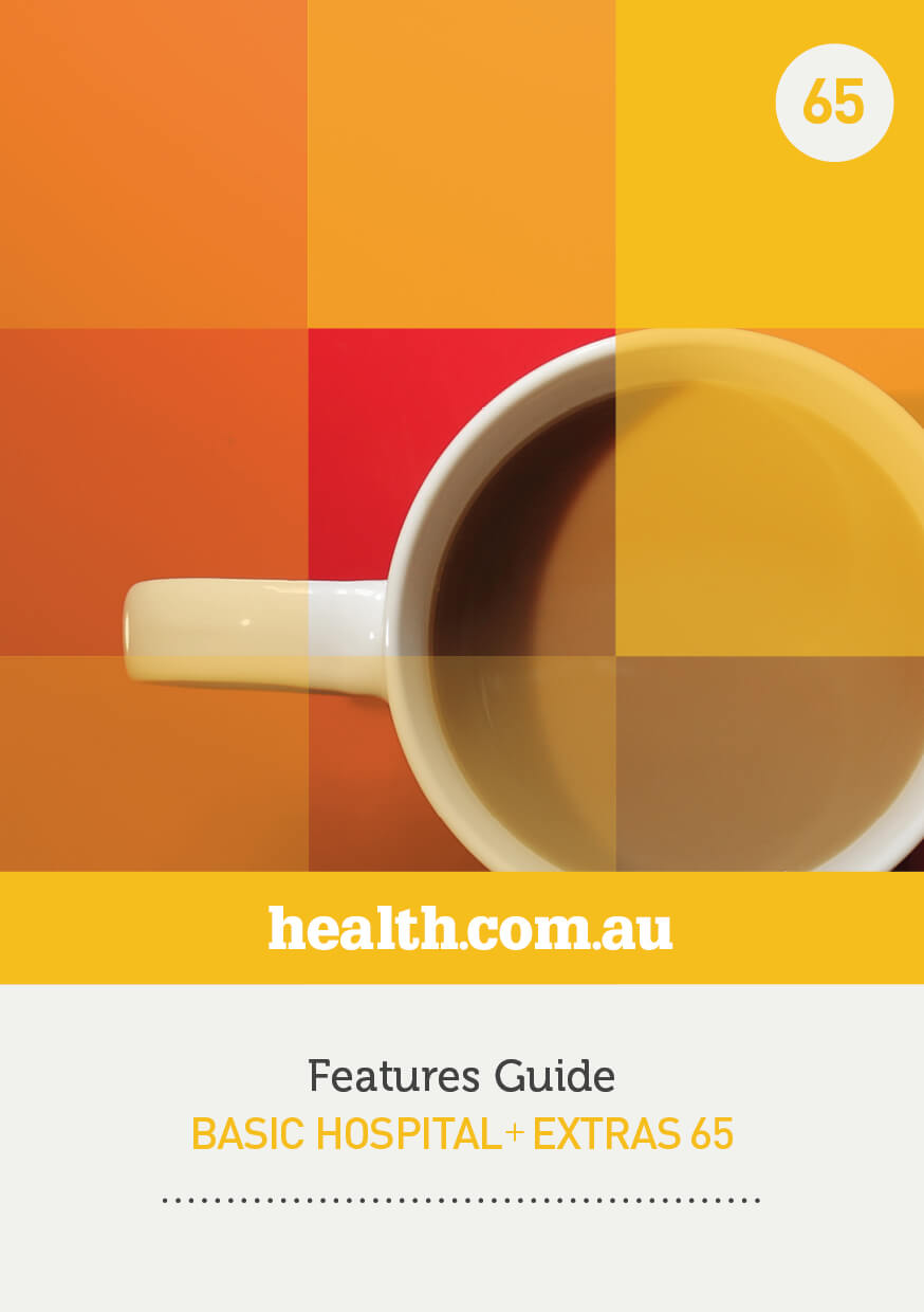
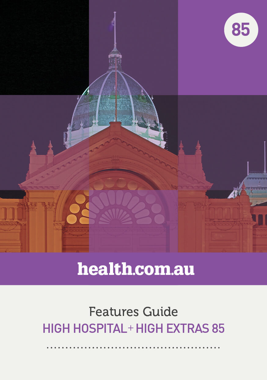
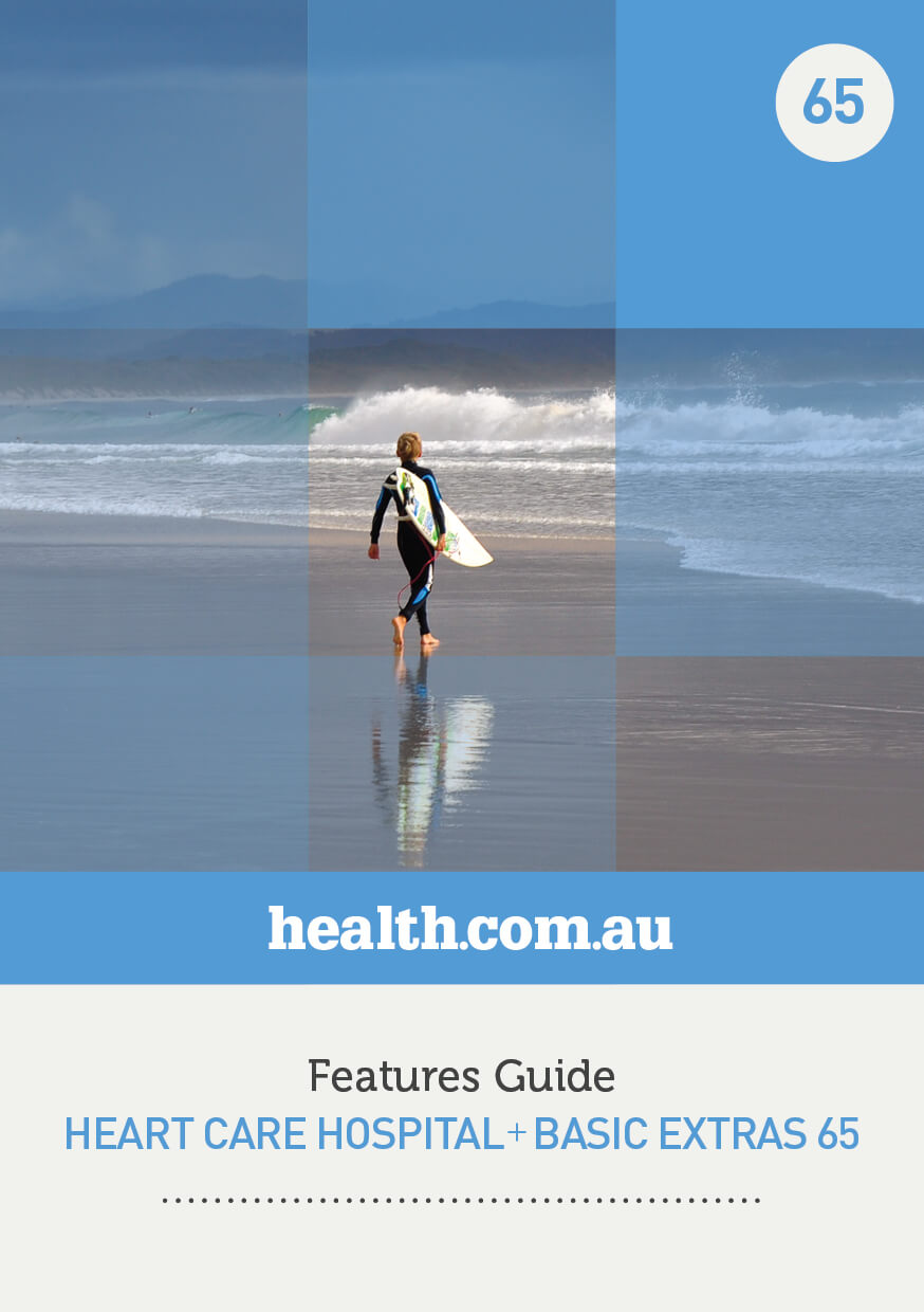
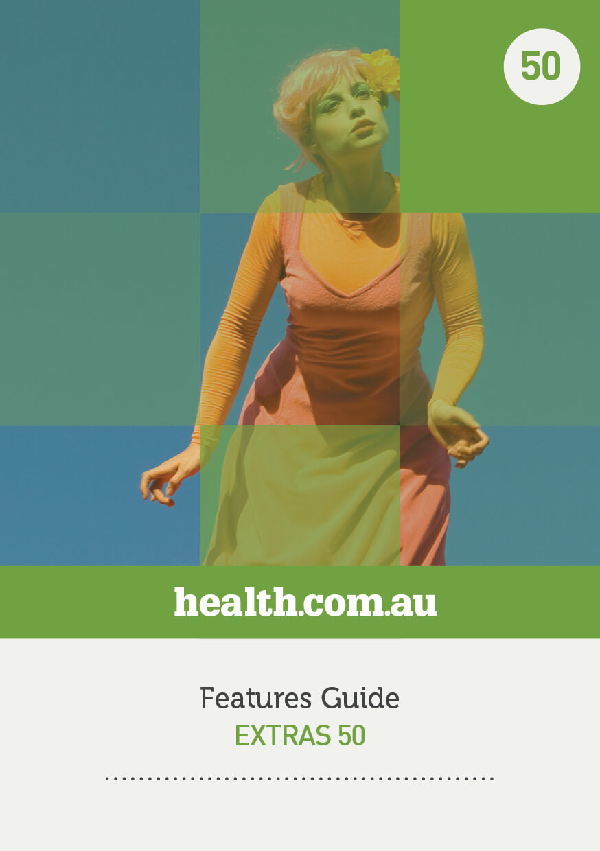
Over time the health.com.au brand has evolved, as every good brand should. The iterations of the brochureware in 2016 used block colours and iconography for online marketing.
Photography for their Product Disclosure Statements moved away from Australian landscapes to a modern, dare-we-say hipster feel. ‘Hassle-free’ health insurance grew a certain type of audience. Their market share of this younger, inner-city demographic is unrivalled in their sector.
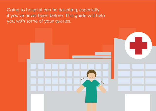
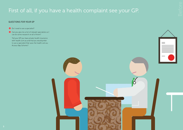
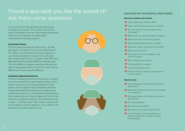
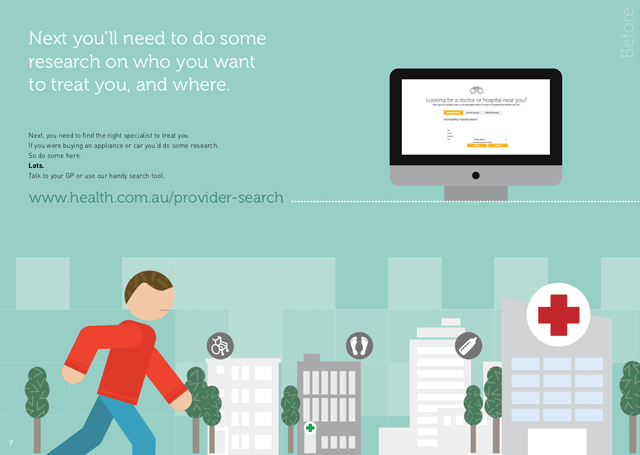
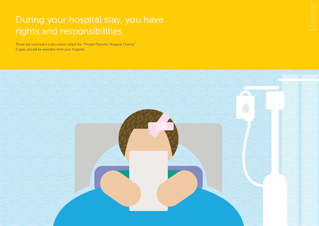
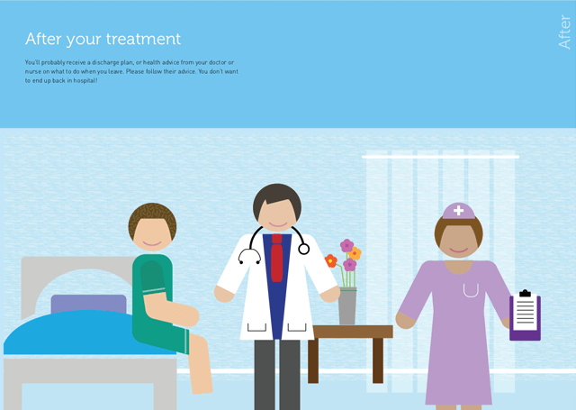
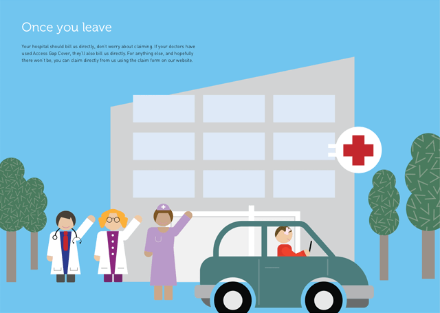
As part of a suite of materials we developed a set of illustrative characters.
Initially these characters were used for an online video guide called “going to hospital”. We storyboarded, developed the entire look and feel and worked with health’s animation agency to bring the characters to life and communicate the complex world of private health insurance.
The characters and style were then adopted for that year’s “going to hospital guide book”. You can see the video below.


Going to hospital video guide
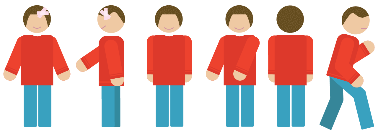
Hero character moves — we love projects like this 😉