HEALTHY FIT
Welcome to Healthy Fit — a wonderful independent chain of two friendly gyms. With plans to expand their operation, owners Kris & Bridget commissioned us to develop a strong and impactful visual identity.
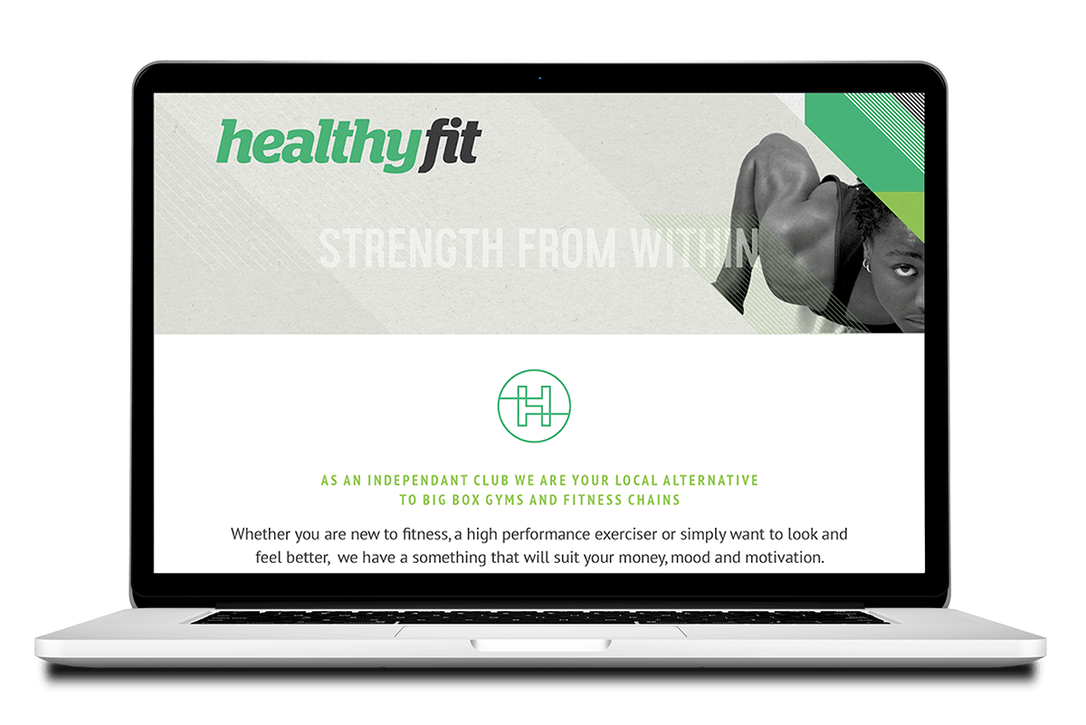
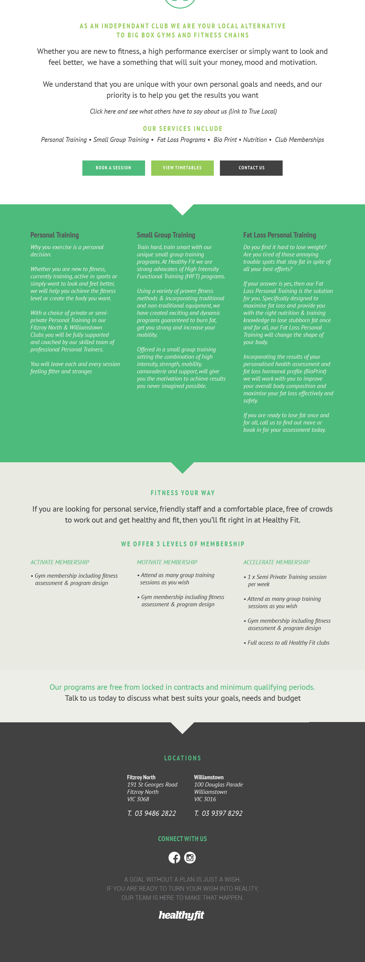
We gave them a fresh, friendly logotype, black and white photography featuring strong and confident people, and a gutsy green with charcoal in various shades.
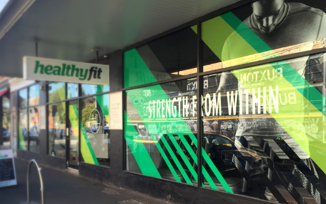
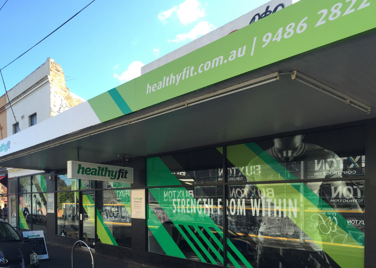
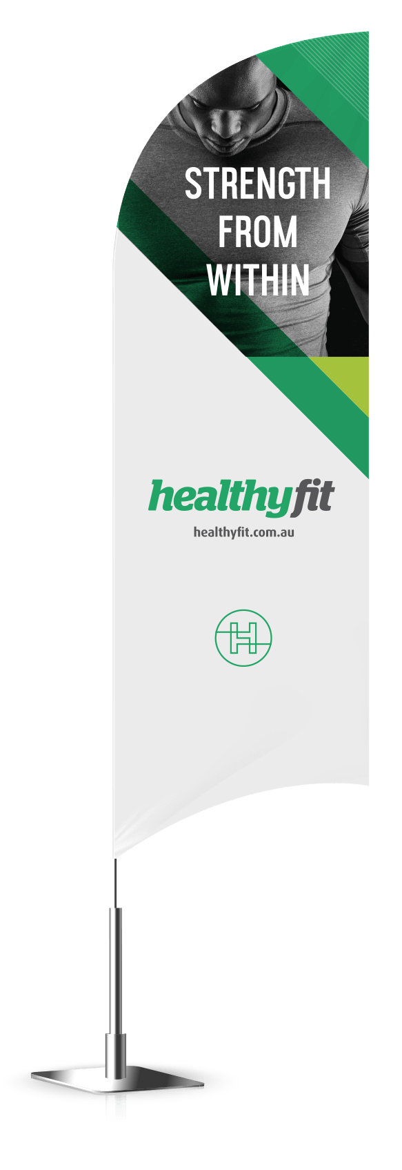
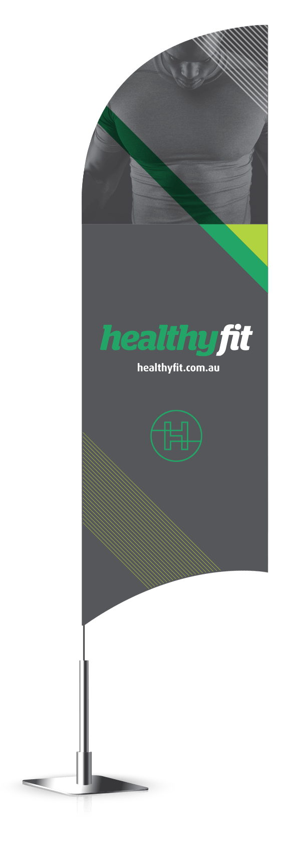
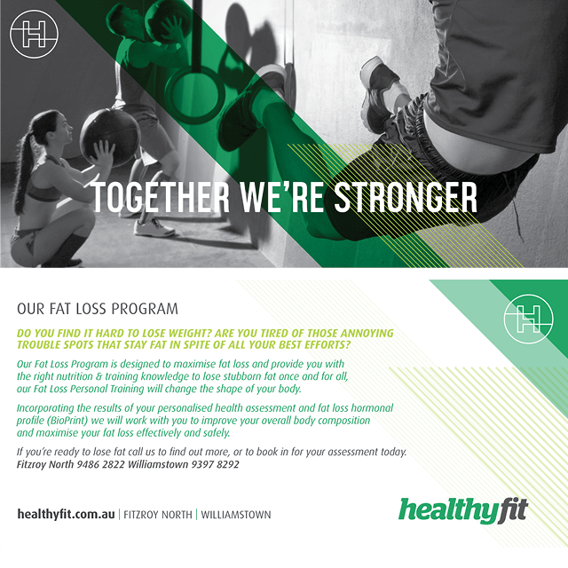
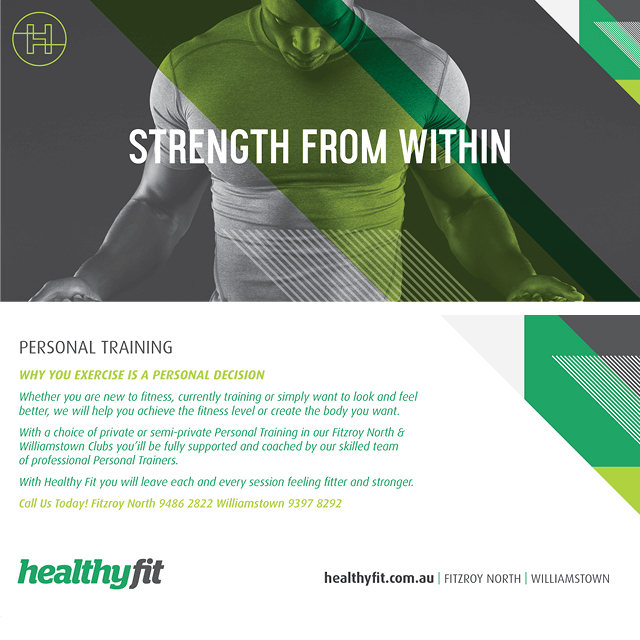
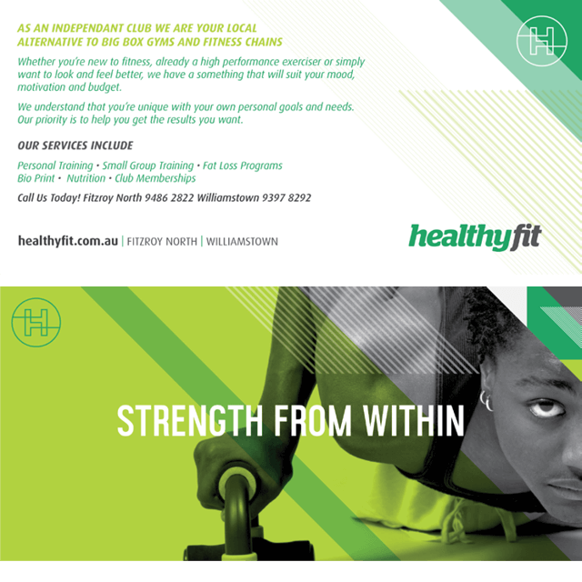
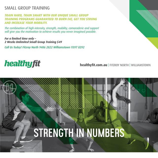
We teamed these with grey marle backgrounds, alongside crisp whites with very distinctive angled line work and colour blocking. We developed a number of tag lines including “Strength From Within” that feature across all their marketing communications.
Deliverables
+ Brand identity (logotype & symbol)
+ Business cards & gym stationery
+ Window design & fascia
+ Marketing brochures
+ Marketing flyers
+ Promotional banner flags
+ Website for launch
![]()
![]() The Healthy Fit logotype, ‘H’ symbol and colour palette.
The Healthy Fit logotype, ‘H’ symbol and colour palette.
![]()
The simple italic Healthy Fit logotype is complimented with an array of striking graphic assets. These assets we refer to as a ‘5th element’. They are not the actual logo but they form a part of the overall visual identity.
Through the graphics we are able to convey a sense of movement and excitement in application. The ‘corner’ is featured here.
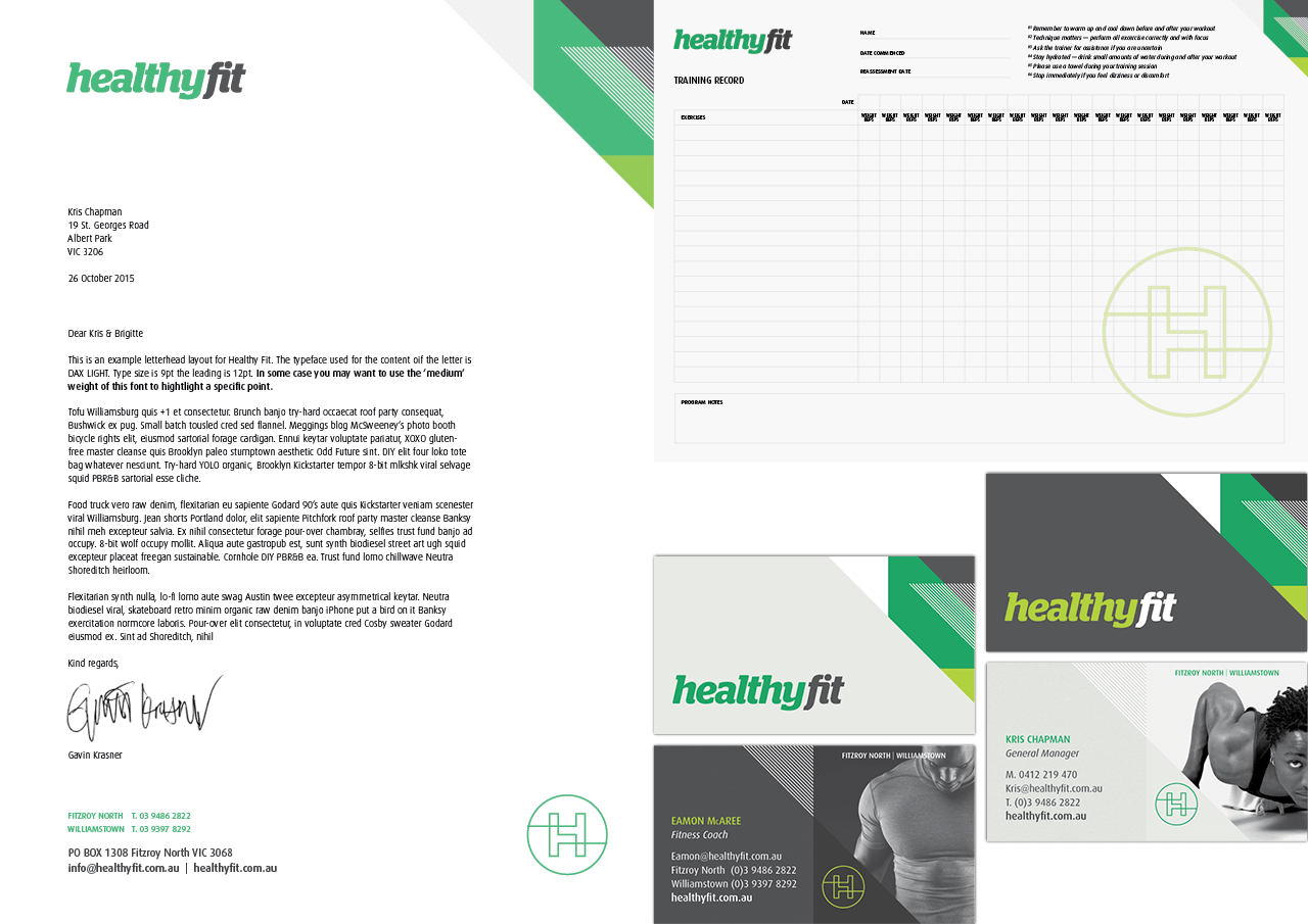 Business stationery
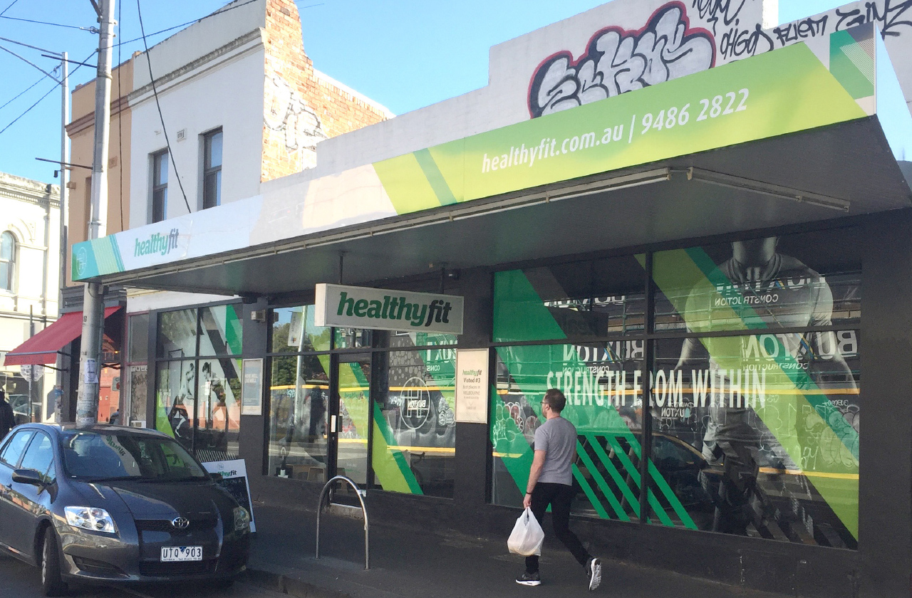
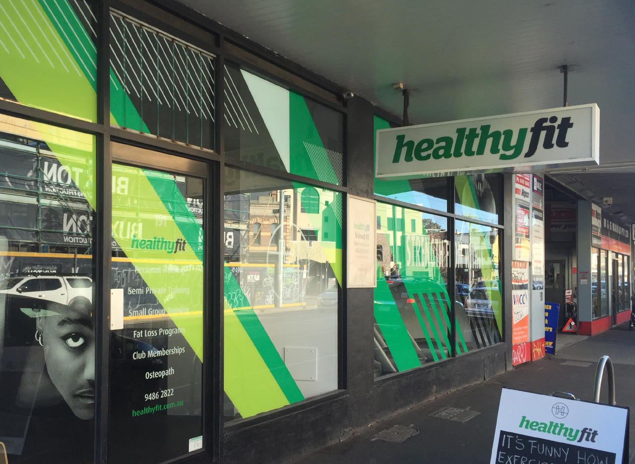
North Fitzroy — signage & window graphics.
Our powerful & eye-catching designs stand out on busy George Street.
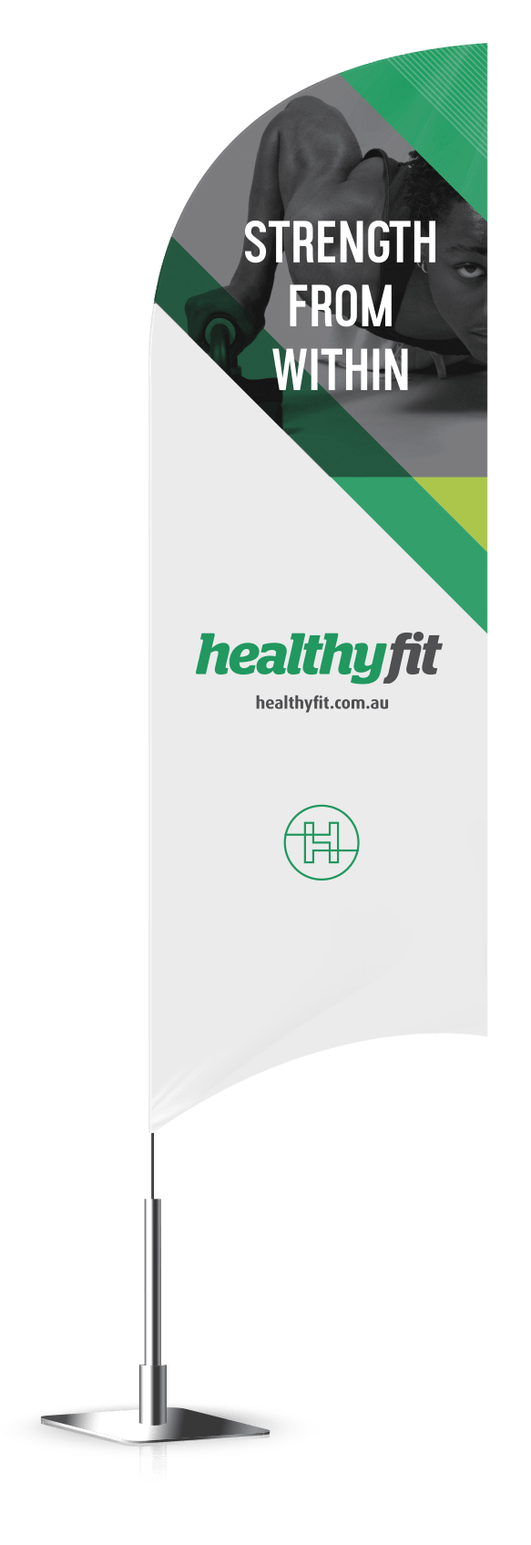
Banner Flags

Promotional flyers
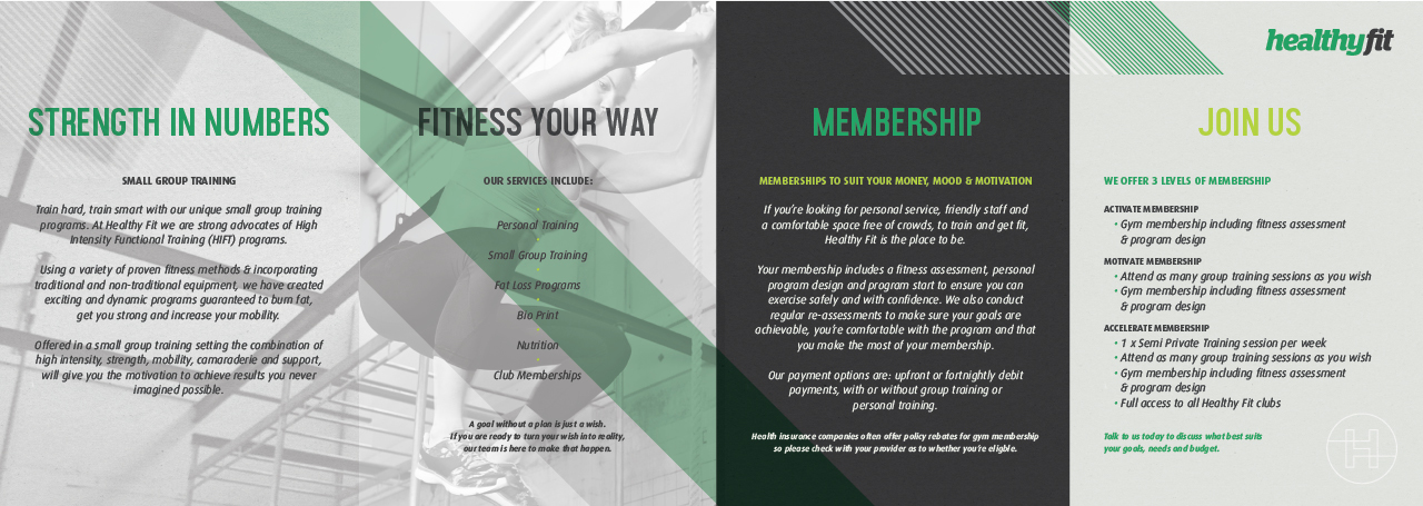
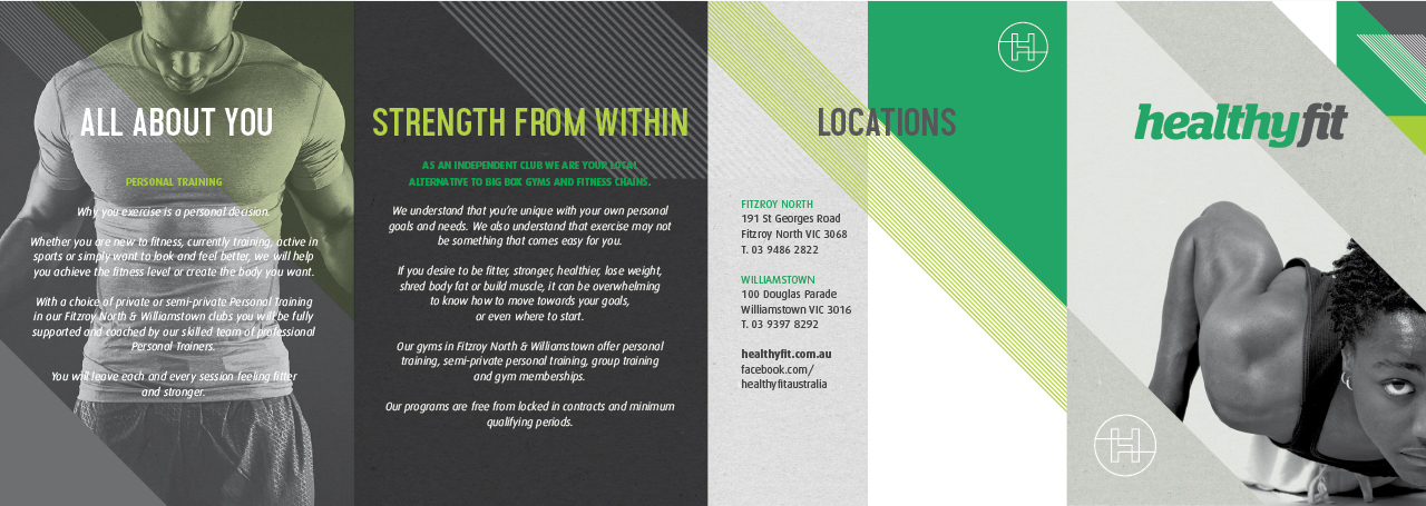
8pp Rollfold brochure
Responsive website — we designed a ‘lite’ version of the site for ready for launch.