I N S U R A N C E B O X
Insurance Box is a revolution in car insurance in Australia (now owned by QBE). How so?
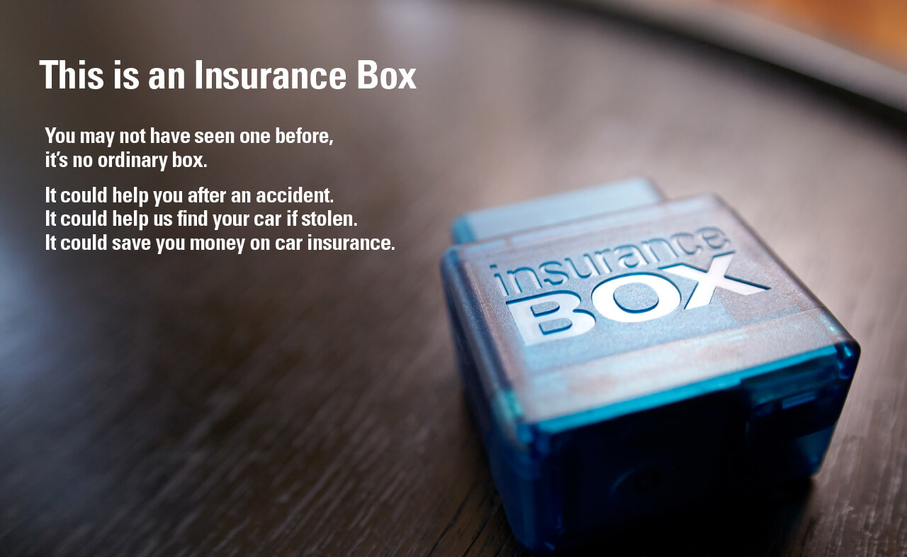
Insurance Box is literally a small box that plugs into your car that measures how well you drive; or not. This is completely different to the way all other insurers determine the cost of premiums. If you’re 18 years old then your premium cost will be based on the driving behaviour of every other 18 year old on the road. So too bad if you’re a very safe driver, you’ll be paying for the increased probability that ’18 year olds are more likely to have accidents’. Insurance Box monitors your driving behaviour and gives you a premium based on your DriveScore. If you’re a good driver you’ll pay less.
The project was over a year in the planning and Chops For Tea were there from the beginning. We shaped the look and feel of the brand, creating every single touchpoint. From the insurance certificates and documentation, to the design of the website, animation of infographics and art direction for the television commercials. The result is a complete brand experience with a distinct personality.
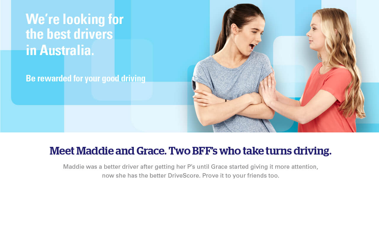
Insurance Box is targeting young and first time drivers and images from the ‘Journeys’ (case studies) section of the website are detailed here.
Deliverables
• Brand Identity
• Brand Guidelines
• Business Stationery
• Insurance Certificate & Invoices & Collateral
• Product Disclosure Statement
• Explainer Video (Graphics & Storyboarding)
• Googla Banner Ads
• Office Wall Graphics
“We enjoy working with Chops for Tea because they are ‘agile’ in their approach; with clever copy & fresh design that cuts through to our customers”
Frank Peppard — Chairman

The Insurance Box brand mark is strong & simple — with the inclusion of the graduated line creating a sense of movement.
Insurance Box explained in 30 seconds.
Explainer videos have become something of the norm these days — they are generally a way to engage with your audience with immediacy. Conveying message and delivery style in one swoop. We created the storyboards, illustrations and worked with an animator to bring this to life.
Website Design.
For launch Insurance Box targeted young and first time drivers.
Above shows images from the Journeys section of the fully responsive website.
Update this image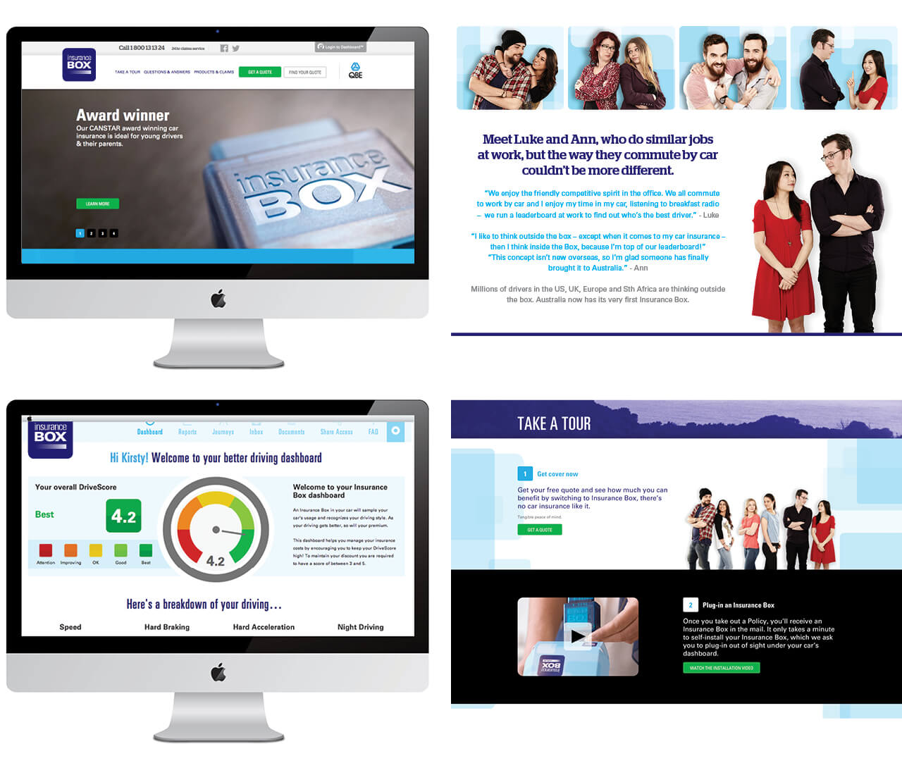
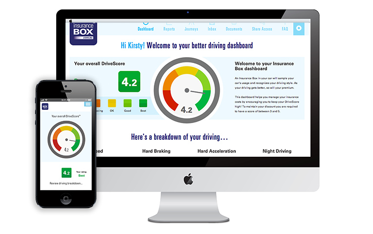
Drive Score Dashboard design.
Customers are directed to this screen (when they log in) and are able to review their driving performance and scores.
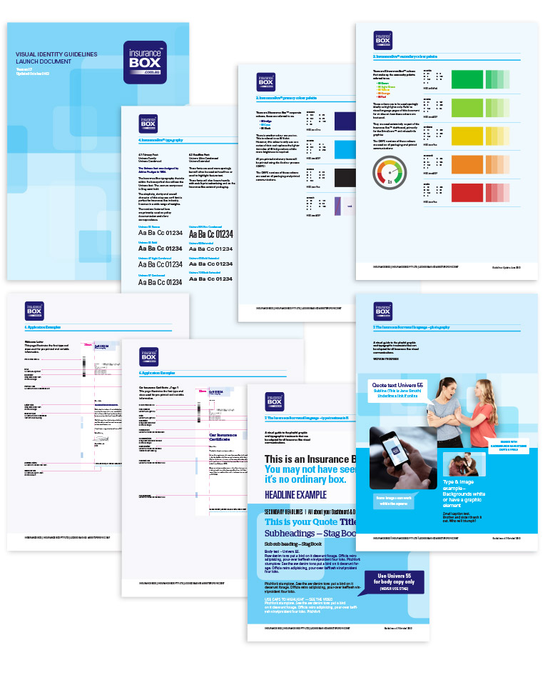
Pages from the Insurance Box brand guidelines
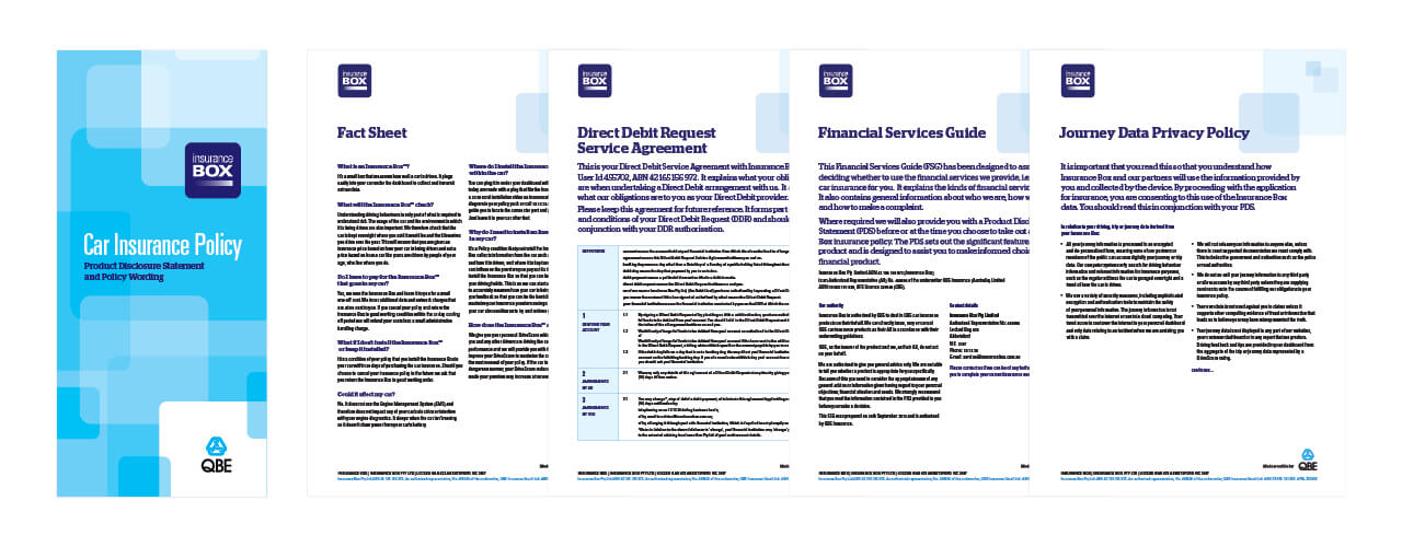
Product Disclosure Statement
Aside from the brand mark and application we produced extensive brand guidelines detailing every aspect of the Insurance Box communication suite.
The document included everything from client invoices to PDS (Product Disclosure Statement), Drive Score™ charts to insurance certificates, illustration & photography styling. We created every single communication touch point.
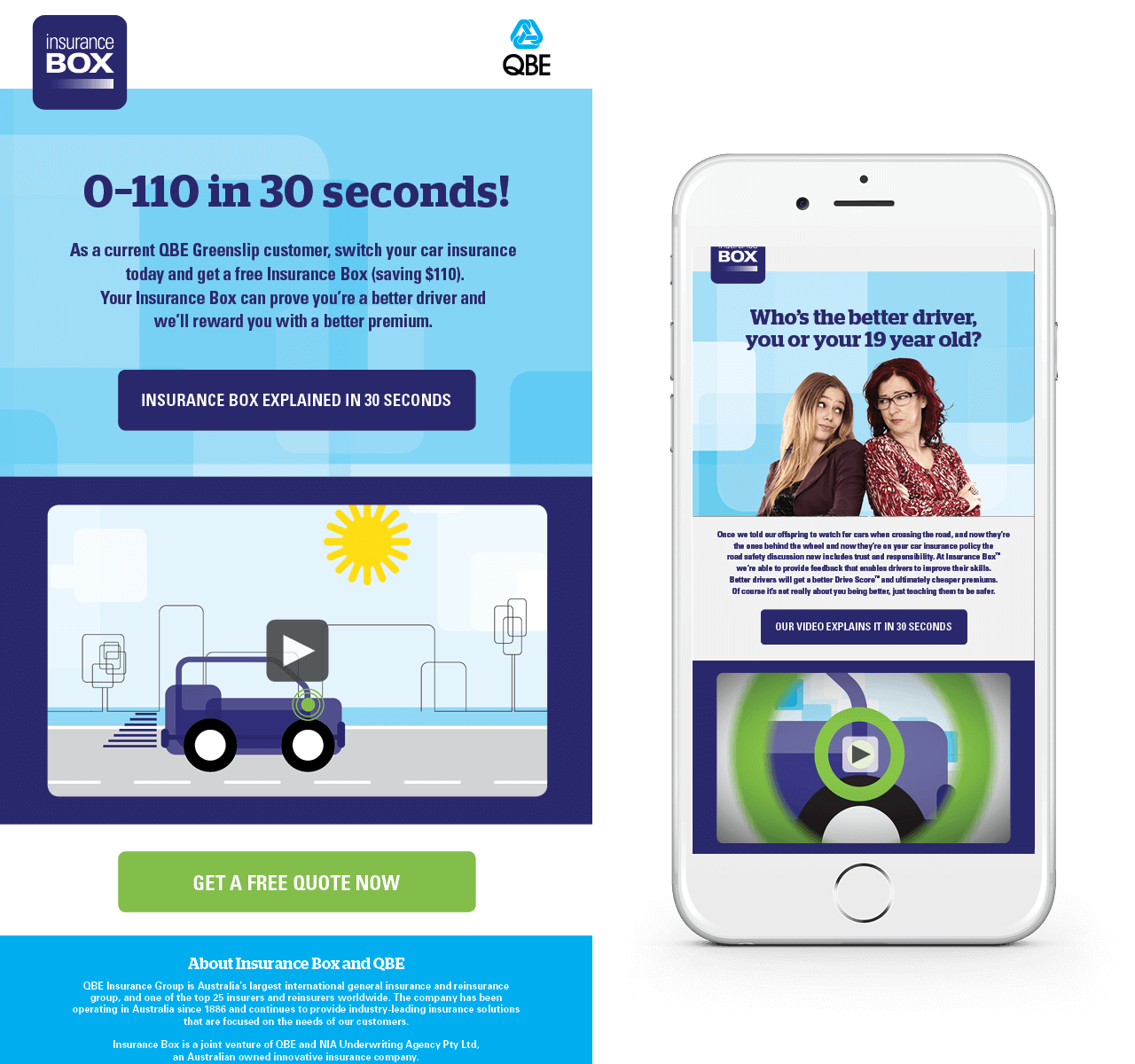 Creation of eDM campaigns.
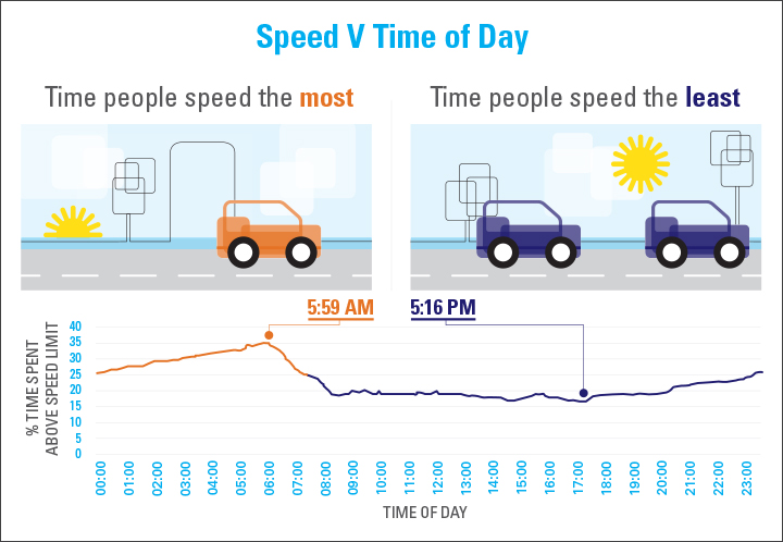
Having fun with graphics & charts. We developed a distinctive illustrative style.
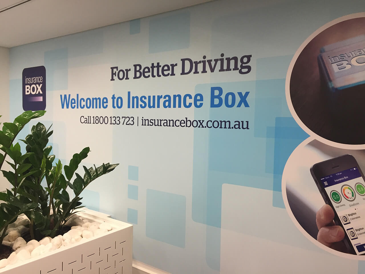
9m Supergraphic covering a wall at the Insurance Box office.
All photography by Marc Buckner | All copywriting by Elizabeth Geddes.